

This week I’m looking at Will’s website Dealyze.com. He’s got a Y Combinator backed startup selling some kind of electronic loyalty card system. Let’s dive in and see what we can learn…
1. Your opening headline should be a concentrated sales pitch.

Here’s the opening copy…
Punch Cards for the 21st Century
loyalty, email & sms marketing, referrals and more!
The first question that comes to mind is – how familiar are people with the term “punch cards”? Is that an American name for “loyalty cards” that I’m just not aware of? It’s entirely possible. But when I Google “punch cards” 95% of the images I see are old computer punch cards. When I Google “loyalty cards” or “reward cards” 95% of the images are what I think it is we’re really talking about.
The second line, the sub-header reads like a list of marketing words at the moment. I have a general idea what the site is about, but not why it’s special, not why it’s different.
Action: Once we’ve established what the real unique value of this product is, put it into a real sentence as the sub-header. And use the most recognizable way to describe the product in the headline.
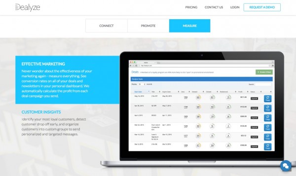
2. Use your images to tell a story.

There’s a place for static product shots, but when you’re opening the site, you’ll do better with an “action shot”. Instead of just showing the product, show the product being used, in the relevant context, by people. The one above is a good example, but if you could get a human face in there even better.
Right now this image is being used as a faded out background shot. And it’s obscured by multiple product shots.
We have to remember that our product is not really the star of the show. Our customer is the star of the show and what they really want to buy is more money in their pocket. Our product is a means to that end, but not the end goal.
Action: Use images to tell visual stories. But keep the customer and their world as the star of the show.
3. Does your USP solve the most important problem?

Here’s what’s being highlighted as the most important thing about this company…
WHY WE ARE DIFFERENT
You worked hard to build a unique brand and business that your customers fell in love with. Don’t settle for a loyalty system that throws their branding all over your store and drives your customers to go to other businesses.
I can’t help wonder if this is the biggest problem that needs solving in this space? There’s lots of competition to get users’ private information, so that retailers can track their shopping habits and email them. So, to stand out, we really have to solve the most pressing problems.
Do other loyalty card systems really encourage shoppers to go elsewhere? Is branding really the big problem to solve? I’m not so sure.
The motivation for using a loyalty card, from the consumer’s point of view (the people who really matter), is free stuff. Or more accurately, the game of getting free stuff. The reward of moving towards the free stuff is half the fun. A loyalty card has to be very easy to use. It has to be clear and obvious what the benefit is. And it needs to have almost no friction when using it.
The second you move from printed paper cards and a stamp, which is a system that’s really easy to use, to a digital system of any type, where you’re asking for a user’s private information, you’ve already increased the friction 100 fold.
And not for any obvious extra benefit on the customer’s side.
I’d say the biggest real-world challenge isn’t branding, and it isn’t about the retailer. It’s much more fundamental. How quickly and smoothly you get people using this system at the checkout?
Slowing things down at the checkout is a major problem for busy retailers, so their number one problem is going to be friction.
If you want to persuade a retailer that your system is better than all the competitors, you’ll have to demonstrate that your system has the lowest friction in the business.
The easier and faster it is to use, the more people will use it.
Custom branding is a nice to have but I don’t think it’s enough to have as your only USP. Because a business like this isn’t won or lost on the concept, it’s all about the execution. Convincing retailers to try it is only the first step, getting consumers to actually enjoy using it is the real goal.
Action: Consider whether your USP is really solving the biggest problem that your customers face. Having a unique selling point isn’t enough. You have to have a unique selling point that your customers really care about.
4. You absolutely need a video showing this working.

You absolutely have to make a video demonstrating a product like this. Because it really isn’t clear how the pieces fit together. You have plastic cards, how do they work? There are pictures of “an app” with QR codes, is that an alternative to the plastic cards?
By trying to cram the entire product demonstration into a series of hidden pages and one line descriptions, it just isn’t clear how this works. There should be a clear path A, B, C. The more options you add to the story, the less clear the basic process is.
As already mentioned, the whole issue of “signing up” can’t be explained with a few one liners. Getting people to overcome that friction of signing up is 99% of the task you’re building your business upon.
Right now it reads like you have to sign up at the checkout, then go to the website, then download an app.
Action: Avoid hiding basic content about how the product works behind buttons and links that need to be uncovered. This isn’t a treasure hunt for basic information. Make a video that shows in real-time how quickly and easily this system works at the point of sale.
5. Bring this down from the theoretical to the hands on.
There’s something about all the copy on the site which doesn’t quite respect the amount of thought a retailer will put into this type of purchase.
If you want them to care, you have to give them a full and detailed sales pitch. You have to offer proof on top of proof that this will put more money in their registers than it will cost.
They demand more detail, more specifics. Less theory, more “show me the money”.
Don’t just say “send deals” or “beautiful newsletters” or “reward customers”. Show me some specific case studies where you work with a certain type of business, they offer a very specific type of offer, and they get a specific type of return.
Not all retailers are the same. A coffee shop is not the same as a clothes shop, is not the same as a hair salon. And this type of system will work better in some than in others.
Instead of trying to sell this system to anyone, I’d be trying to prove its value with the most likely type of retail environment.
Setting up free trials in a number of different types of retailer and then working closely with those retailers to master the process in that niche.
It can’t just be about getting terminals into shops. They have to be valuable over the long term. For retailers and for consumers. So you have to be the experts on how to help your retailers get the most out of this way of marketing. You should be the fountain of all knowledge for exactly how to get the maximum number of people to sign up, which type of offer works best, how frequently to send out promotions, what format of email works, etc. etc.
You have to be demonstrating that this stuff really works in the only context that matters to a retailer – other shops just like theirs. So far, there’s not even an attempt to prove that a retailer can expect any kind of return on investment.
Action: Divide all retailers up into similar niches. Food, hair and body services, fashion, etc. Pick the ones you think most likely to succeed with the benefits and limitations of this technology. Double down on working with a handful of retailers in each niche to master the whole process and prove the value of this system. Use those retailers as case studies, then reach out to the rest of those niches through their trade press, industry distributors and associations.
6. Don’t fire bullets at customers, tell them a story.

Lose the features / bullet screen. I want you to imagine two sales professionals at a trade show, both talking to potential customers.
One of the sales professionals is telling a story…
A story about how he recently worked with a lovely young Entrepreneur called Vanessa. Vanessa who owns a small chain of nail salons. Vanessa has been using the countertop display to gather her clients’ details. She tested a few different incentives and found that her customers most responded to an offer of a completely free pedicure for them and a friend. Not only did this offer make it really easy to get people on board but Vanessa saw a 25% increase in new customers who’d been introduced to her salon through the offer.
After the initial offer, Vanessa has been using the beauty services email template to email her customers in batches, every 4 weeks. Just about the length of time that they might be thinking about their next manicure. She also does a separate email, once a month, where she sends out a special birthday promotion offer to anyone who has a birthday that month. She’s seen a 50% increase in people buying her special birthday pampering party. A package where customers can bring their friends for a manicure, pedicure and a glass of sparking wine before they celebrate a birthday night out.
The other sales professional is reciting a list of features…
Branded Tablet & Stand
We will design a branded 10′ Samsung Tablet and ship with a high quality Heckler Stand.
Branded Web App
The average person checks their phone over 1500 times a day. Your logo is now on their home screen!
Plastic Cards
Hand out high quality, branded loyalty cards and key tags to your customers.
Website Plugin
We seemlessly integrate with any website so your customers can sign up from anywhere.
ZZZzzz
Which sales professional do you think will sell the most?
My guess is, the first one. The one telling a real story, about a real person running a real business. A story about how our technology is helping her do business in very specific and inspiring ways.
Action: Don’t shoot bullet points at customers unless you’re summarizing a lot of information you’ve already covered in detail. Tell then stories. Our websites are just digital sales people. They have to explain our value in an interesting, energetic way, they have to offer lots of proof and they have to build trust.
7. Go beyond stock photography.

Replace the generic “happy office people” photos with images of real people. Like the page full of icons above, stock photos suck the life out of a sales pitch. They shout “We’re fake and we’re hiding behind some people who don’t really work for us”. It subtly eats away at the trust you’re trying to create.
Look at how big the picture of the fake people is, compared to the tiny head shots of the real people you’re doing business with. That should be the other way around.
At this stage, you don’t have an established brand. You just have an idea. And ideas are not a solid enough foundation for people to really trust us. We have to earn that trust, develop that trust, and prove that other people trust us.
Create an About Us section where you demonstrate who you are, what your background is, why you’re in this business and why you’re going to be in it for the long haul. There should be dozens of big, happy human faces on that page, founders, staff, customers, investors, people saying good things about you with their smiles.
Action: Lose the icons and replace the stock photography with real human faces of team members, partners and customers.
8. Tell me exactly what to expect.

Never have a generic web form as your only call to action. It’s like asking people to walk into a dark cave when they don’t know what to expect.
Have a big friendly picture of the person you want them to contact. And make it clear who or what that person is called. Even better, have a video of that person introducing themselves.
If you’re just trying to get an email address, the less you ask the better, but if people are requesting a call-back it’s fine to ask something specific about their business. Communication is give and take, I tell you something about me, you tell me something about you.
Asking what business they are in is a good start. Asking what would be a convenient time for them to be called is another.
Let them know exactly what to expect. The human brain hates unpredictability more than just about anything else. When you ask for their details but don’t give any indication of what will happen next, or when it will happen, you’re asking them to submit to your unpredictability. Most people simply won’t do that.
And retailers are busy people. Let them know what will be expected of them. “Request a demo” isn’t enough. How will you demo? Where will you demo? What’s the cost in time and energy, and ability to say no, going to be?
Action: Customers are busy, cynical, skeptical, and afraid. Make it easy for them to make contact with you in a number of ways. The more they’ve seen you, heard you, and learned from you in advance, the more they will trust you to actually talk about buying a product. You could get 100x more people to see you demo your product by doing a video webinar. Where there is less pressure on the potential customer, but you still get to collect their email addresses and you still get to chat and answer their questions.
Summary.
Right now this website is just pitching a concept. It’s not selling the value of this service in enough depth. We have to persuade retailers that it’s relevant to their particular type of business. And we have to demonstrate that it will deliver a return on their investment. Divide the market up. Focus on really mastering one or two niche’s at a time. Prove your marketing expertise beyond the terminal and software. And then communicate those results in a series of case studies featuring real people with real businesses. That will open up a whole new set of routes into the market place through trade press and existing distributors.
I’d like to thank Will for sharing his work and helping everyone learn from the process. Until next time, stay the course, see it through, make your mark! 🙂

This week I’m looking at Benjamin’s website 80000hours.org. He’s got a Y Combinator backed startup. They help people make fulfilling career choices that also have a positive impact on the world. Let’s dive in and see what we can learn…
1. Always answer the question – What’s in it for me?

The opening copy is as follows…
Find a fulfilling career that does good.
Receive part of our career guide in your inbox each week, for nine weeks.
It’s based on five years of research alongside academics at Oxford.
On the surface, the first sentence may appear to be balanced. “Find a fulfilling career that does good.”
It’s combining an internal value that benefits us, with an external value that benefits others. Seems fair, right?
But in reality human beings are far more motivated by internal, personal benefits than we are by helping others.
Here, and in other places throughout the copy I think there’s a fractional over-emphasis on the external value of “doing good”.
Essentially “doing good” is the product that is being sold here. But if you really want more people to “do good” you have to be really clear on what’s in it for them.
Imagine for a second that “doing good” is a toaster. If this page was selling toasters, I would say to you – stop talking about how shiny your toaster is, and talk about how much more your customers could enjoy their hot buttery toast.
If you want to convince people to help others, show them 10 ways in which it benefits them first.
If you have to boil that idea down to a single headline or opening sentence, make sure that as a minimum you’re focusing on 2 reasons why the individual will benefit for every 1 external benefit. Even if it sounds like you’re repeating yourself.
For example:
Find a fulfilling career that does good and makes you happy.
Find a fulfilling career (internal value, you benefit)
that does good (external value, others benefit)
and makes you happy. (internal value, you benefit)
Call it a selfish sandwich if you want. (I win, they win, I win.)
Now I wouldn’t use that exact headline, I’d put the time in to come up with 2 more distinct personal benefits, but I hope it illustrates the balance that will be more effective.
This isn’t about philosophy, or morality, it’s about what’s going to work.
Action: Marketing has to deal with how human beings are, not how we would like them to be. Throughout the copy, make sure to emphasize the personal benefits of doing good work far more than the external benefits.
2. Give the basic idea enough room to really sink in.
Although I love a good bar full of credibility, especially when it has links to great stories, in this case it’s cluttering the introduction. It’s too high up, and it stands out too much, taking attention away from the opening explanation of what you do.
Luckily, we don’t have to go far to solve these initial copy problems and distractions. The very next section has a much better description of what you do, and with just a couple of tweaks, it would make for a much clearer opening.

This is clearer, visually and mentally. I’d use this as your opening page with a few, small tweaks…
You have 80,000 hours in your career…
Make the right career choices, and you can have a hugely positive impact on the world and a much more rewarding and interesting life.
We’re here to give you the information you need to find that fulfilling, high impact career. Get our 9 step career guide, sent direct to your inbox once a week.
Our advice is based on five years of research alongside academics at Oxford and is tailored for talented young graduates.
Sign-up box or Start Reading Now. (on same line)
I would blow that up to fill the screen. No other distractions. Then, the next thing down the page should be a line of human head shots, featuring the people you’ve already helped and their case studies.
I would also split test removing the “Start reading now” button and see how it affects your sign-ups.
Action: Enlarge the current “what we do” panel to be your new introduction screen. Remove as much distraction as possible. Then continue down the page with the human head shots and case studies next.
3. Everything comes down to identity, work with it, not against it.
What makes people want to do good work? There are various individual answers to that question, but they all come back to one simple idea – good work is consistent with their identity.
People will choose “good work” if it aligns with how they see themselves. And how they see themselves is constantly being shaped by their upbringing, their family, their peer group, their mentors and their own life experience.
At the end of the day, they need to feel that “doing good work is just like me, right now”.
But of course we often have conflicting ideas about who we are, especially when we’re young. We just haven’t made those decisions yet. So, to help people decide that “good work is just like them”, we have to look at all the reasons that may not be true and reconcile those issues one at a time.
Imagine the internal conversation, “I would do good work but…”
“…there aren’t enough good work jobs.”
“…there isn’t enough money doing good work.”
“…my parents paid for me to study (some non good work thing).”
“…it’s a family tradition to do (some non good work thing).”
“…I’ve already invested years into becoming (some non good work thing).”
“…my friends all do (some non good work thing) for a living.”
“…I’m not sure I have the skill set to do (some non good work thing).”
What we ultimately have to do is give people the tools to show them that doing good work is actually perfectly in line with those other values that are important to them. Not trying to change those values, that rarely works. Showing how those values are actually consistent.
One very important value that any young person holds dear, is the idea that they can make their own choices and that this is ultimately what being an adult means.
I can imagine that many of the competing values your “customers” will be struggling with will involve the parental expectations. The more tools you can give people to have those conversations in a structured way with their parents, the more likely they are to make an independent choice.
At the end of the day, most parents want their kids to be happy (even if it is by following their plan and definition). And most young people just want to be loved and respected by their parents (whilst following their own plan). It’s our job to remind both sides what the ultimate goal is – happiness – and demonstrate that this decision is being made after much rational, mature consideration towards that goal.
Action: Remember in all cases, persuasion requires a deep understanding of the identity of the customer. The desire to make an adult choice will be strong. It will also come with conflicting parental and peer group values. Give the customer the tools to resolve those apparent differences in values, so both sides can focus on the end goal of “happiness”.
4. Guide your user.

Selling the basic idea of what we do is hard work. We’ve thought about it for hundreds of hours. But our reader has just heard about it, like 5 seconds ago. After reading the introduction, people are mentally trying to comprehend what it actually means to them. So, try not to distract them by forcing unnecessary decisions.
Right away we’re presenting them with a choice, do I go left or right? Graphically it’s actually represented as if there are 3 choices. That’s unnecessarily confusing.
The direction should always be the same – deeper into the topic.
Quizzes can be very effective (and they make a lot of money for fitness websites). Email guides can be very effective. But I’d split test offering one or the other and see which works best for your opening page.
The loser could still be a step in the process, but don’t make it the first thing people have to make a choice on.
Action: Don’t make people choose unnecessarily at a point where they aren’t invested. Guide them deeper. Step by step.
5. Spend as much time on the headlines as the content itself.

On the next section of the page it seems like you’re attempting to draw people into the various chapters of your career guide, but I don’t like the abbreviated headlines you’re using.
They sound a little “know it all” or “actually-ish”.
That approach might repel the people you want to read them, but encourage the trolls. When I click through, some of the headlines on the content are actually much better.
I know when you’ve done a bunch of research and come up with “the answers”, it’s tempting to lead with those answers. But in my experience that just doesn’t work. You have to remember that your reader hasn’t done the research that you have, they don’t have your perspective.
If you lead with the answers your readers will jump to conclusions. Either agreeing or disagreeing instantly. The internal attitude is “yeh, yeh I know all this”. Or “that’s nonsense, I know something else is true”.
We don’t want that here, we want people to read your guide. So, we have to tease them in with headlines that connect with where they are at right now. Then we can take them on a journey and arrive at the “answers” at the end of that journey.
Just bear in mind your audience, and test to understand what headlines they prefer to respond to. Headlines are really, really important. Without the right headline, the content might as well not exist, because no one will ever see it.
And the more the headline (and content) speak to and resolve those conflicting identity issues we discussed earlier, the better.
Headlines like:
- What to do if you parents paid $100,000 so you can study law but you want to go into sustainable energy.
- How to tell you parents that being being in finance isn’t going to bring you the happiness they want for you.
- How to know if you’re the type who could find happiness helping others.
-
I’m making these up, based on my 5 minute psychological profile of your audience. The point is, a headline should really grab someone and move them towards a solution to those deep questions they’re struggling with.
Action: Don’t give people “the answers” in your headlines. Instead, hook them with the problems they are struggling with.
6. People are important.

I love the “About” section, even though it makes me feel old. In fact, I may have unwashed coffee cups that are older than you guys. 🙂
But it also makes me hopeful for the future. Well done on putting this together, I have huge admiration for what you’ve achieved, even as I’m trying to find holes in it. Overall this is a very well put-together site.
I do want to emphasize how much it changes the feel of a page when, as a reader, you finally come across some humans. It becomes less theoretical, more emotional, more “real”. That’s the state you want to encourage if you expect people to buy something.
Yes, people will judge you when you show yourself. They’ll think you’re too young, or too old, or too white or too black or too fat or too whatever. Just like every time you leave the house. It’s what people do. We want to surround ourselves with people “just like us” because it makes us feel safer and it reinforces that identity again.
But it’s also why it’s essential to do it. So the people who are like us can feel that connection.

And finally we come to a series of case studies. I love these, they’re superb. Keep making them. You can never have too many case studies. Just move them to the top of the page.
Action: I would recommend having the case studies higher up the page, under your opening statement. Bring that humanity and relevance in right at the beginning of the story.
Summary.
There’s a ton of good stuff here which only needs a little tweaking and re-ordering. Remember to always over stress the personal benefits of helping the world. Simplify and create space so that people deeply understand your basic premise. Bring the humans and their case studies in earlier, to add life and context. Don’t make people choose, it makes our brains hurt, take us by the hand and guide us. Overall, I’m super excited to see how far you guys can take this. Stay the course, see it through, make the world a better place!

This week I’m looking at Natasha’s website SnapEDA, a Y Combinator backed company that’s building an electronic parts library. Their goal is to help designers and builders make stuff faster. Let’s dive in and see what we can learn…
1. It does what it says on the tin.

Technically, a million years ago, I studied Electrical Engineering. So, in theory I understand a little about electronics. In reality I don’t know much at all. So, I was delighted that this electronics-focused website kind of made sense right off the bat.
The Universal Electronics Parts Library
Stop wasting hours creating CAD parts. Download PCB footprints and schematic symbols for millions of parts.
We open with a clear and strong promise. Not only do I know what this place is, I know what I can do here and I know the personal human benefit of doing it.
The only thing I would change about the top panel, is to remove the lifeless printed circuit board background graphic. I’d replace it with an image that shows a real person benefitting from the site.
An icon style image has very little power. It’s symbolic. A product image has more power, it’s an actual, real world thing. A human image has the most power. Our brains are highly tuned to notice other people. In this context, the optimal images are real humans experiencing the different elements of our story. That may be humans struggling with the problem we are going to solve. Or humans enjoying our solution.
Action: In this case, we’re introducing the website, so the more appropriate image is a human enjoying our product. We don’t have to be super specific because this is just a background image. But an image that communicates the message – this site is about people making things with electronics – would add more power to your opening page.
2. Guide people into the process with examples.

Once a user is familiar with the site, it’s likely that they will know exactly what they are searching for when they arrive. And so the big search bar as a navigation tool makes perfect sense. But as a marketing page, for first time users, a little guidance might be needed. At this point we might benefit from making some suggestions to help people further understand what the site is all about in a little more detail.
The ideal way to do that is again to combine the product with the people already using it. I’d recommend something like this “trending” bar, which is from another site, diy.org
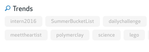
Action: You could add a single horizontal line of trending products / downloads, underneath the search bar. It will peak the user’s curiosity, and help them understand the specifics of what you offer, while getting them thinking about the community aspects of this site.
3. It only takes a second to send people to zzzz.

These features panels get completely scrolled past unless they’re really well designed. Like the first point, it’s about including a relevant, interesting visual. People just don’t go from box to box reading what we write, even if it’s really short. We have to pull them in with an image, and a compelling headline. In this case, what you’re saying is more likely to be read if you split it into 4 horizontal sections with larger text and a headline that sells the benefit.

Look how compelling this Apple image is, (which takes up 3/4 of the screen on the Apple site). Humans enjoying the electronic product. With a clear headline. Just to sell us on reading 2 sentences and finding out more.
We really have to sell every single paragraph we want people to read, or they’ll simply skim right past it. Every sentence on a page is effectively selling the next.
Action: Split the features box into larger full width panels, and include a compelling image and an interesting headline for each paragraph you want to talk about.
4. How to do a great video.

I love the video you’ve created. I love Josh, with his cardigan and coffee and his nerdy charisma. He makes the pitch human. (This is exactly what we’re talking about above when it comes to other images on this site.)
The video has a clear value proposition. It’s obvious how you benefit your customers. It demonstrates visually the “before and after” from a human, emotional perspective, not just a technical one. It includes examples of actual products you can make, just to add context and help with comprehension. And it also explains the community aspects of the site. Overall it does a great job.
So, what I would recommend first of all is having the video sit directly under your opening panel, so, after the initial headline, brief introduction, login buttons, search bar and trending panel, people see the video first. And it should be as big as possible, full page width.
The only thing I would improve about the video, is the final few seconds, the call to action isn’t as strong as it could be. Young Josh opens with a ton of enthusiasm, but ends a little more subdued with “Why not join now?”
Never ask people why they should NOT do something. You’re the party, presume a positive response. Be just as excited at the end of the video as you are at the beginning – “Click the button below and join us for free right now!”
And of course there should be a button. A giant, unmissable sign-up button right under the video. Even better would be one of those timed buttons that doesn’t appear until Josh is encouraging people to sign-up.
I’d also recommend just a single line, reassuring people of what “signing up” actually means. The brain hates uncertainty. What are they signing up to? A free community in which they can get some cool stuff for free and buy other stuff if they choose? Or are they signing away their house, their children and their kidneys?
At any point in the process, if you want to improve the click throughs, tell people what to expect on the other side, so they can see in advance the cost of each action, so they can predict the future.
Action: Make the video the main feature of the homepage. Big, bold, with a stronger call to action at the end, a giant sign-up button underneath and a one line description of what people can actually expect when they sign-up.
5. Turn testimonials into case studies.

I love that you have testimonials, with real people and head shots. I also love that not only do you have a “featured in” panel, but you’ve also linked to the actual featured articles. (I’d open the links in a new window.) So the credibility level of those two things is high, I trust them, so I start to trust the site.
But there’s a huge opportunity to take each of those testimonials further. The beauty of this product is, you’re helping people make stuff. And some of that stuff is going to be cool stuff. (You already touched on that in the existing video). Cool stuff creates all sorts of human emotions. Fun, curiosity, joy. That’s the stuff you want to tap into, because that’s the stuff that motivates people. Or to be more accurate, those are emotions triggered when we’re doing something that’s really close to people’s identity. When we’re tapping into something people identify with.
The more you can define and highlight the core identity of the Maker, the inventor, the creator. With specific examples of the cool, inspiring stuff that people are making, the more people will feel a deep connection and keep coming back.
People are proud of the stuff they make. Especially if they are trying to sell what they’ve made. I’m sure you could turn many of those testimonials into short videos. Stories where real people are compounding the narrative you introduced in the marketing video, with their individual success stories and the resulting creations.
Those videos, with real people and real products, take testimonials to a whole new level. And it doesn’t need to be a big production effort. You can make that kind of video over Skype or Google hangouts and record it with Screenflow. The fact that it looks “real” and not overly produced will add to the authenticity.
Action: Write a 30-60 second script that will allow you to interview your existing testimonials over skype. Have them briefly tell their story and demonstrate the products they’ve made using your service. Make it fun and human, make the inventor the hero, the invention the star and you the wizard / guide who helped make it possible.
6. We get very attached to names, so perfect them as early as possible.

Some acronyms have been around long enough that they essentially become a legitimate word in their own right. But many acronyms, trade terms and buzz words just kill the customers ability to “get it”.
When it comes to naming a company, the stakes are raised to the highest level. So I’d normally stay far away from acronyms and buzzwords altogether.
In this case, I really don’t know what the target audience thinks, but it’s worth raising the issue so we can maybe go ask them and find out.
The company name is SnapEDA.
When I first read the application for this makeover, the name was written in all lowercase – snapeda. My first instinct was “I like the name”. In my head, I was saying “snap-ee-da”.
When I looked at the site, I realized it’s actually “snap-ee-dee-ay”.
Wikipedia describes EDA as: “Electronic Design Automation (EDA) is a category of software tools for designing electronic systems such as printed circuit boards and integrated circuits”.
So, yes it’s technically “snap-ee-dee-ay”. But when it comes to names, it doesn’t matter what’s technically correct. All that matters is – are people going to remember it? Is the name, quite literally, snappy enough?
“snap-ee-da” is easier to say and remember than “snap-ee-dee-ay”. The question is, is it easier to remember for someone in this field? Has the term “EDA” been in use frequently enough and long enough that it’s really seen as its own word, not an acronym that the brain has to translate?
Action: Start a conversation with your customers about which name they find easier to remember. Snap E.D.A. or Snapeda. Not which is technically correct, which is easier to remember, which is “snappier”. Being memorable is a multiplier that makes a big difference to an already solid product when you’re trying to grow.
Summary.
I wish I had time to go deeper into the site, because this is really a good example of a company doing a lot of things right. Of course there are always things that can be tweaked, but I have a ton of respect for the guys behind this site and what they’ve achieved so far. Over all it’s about taking the symbolic, flat, less energetic world of electronic symbols and components and continually injecting the more emotional, interesting, experimental, inventive, curious world of human beings and their cool creations.
It’s who we are, our identity as makers, inventors, creators. The passion that drives us to join a community of others just like us. The drive to master our craft. These human, identity-based motivations are the things that will lead to financial success for this company. Stay the course, see it through, make your mark!

Today I’m looking at Tomas’s website flexreceipts.com. He’s got a Y Combinator backed company that helps retailers move from paper receipts to digital receipts, which have opportunities to encourage MOAR shopping! Let’s dive in and see what we can learn to help us in our own marketing adventures…

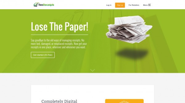
1. Show and tell, get the basics out of the way.
I talk a lot about how important these opening headlines and sub-headers are. It’s really useful for the reader to understand the context of the conversation that’s going to follow. We have to feel like it’s worth our time investing further in the page.
On first glance I like the copy…
Go Beyond the Sale
Unlock the power of a digital receipt that builds your brand,
engages your customers and transforms your business with
valuable analytic insights.
I think we can improve it, but that’s ok. Even as it is, I have a good idea what this product is, and what it can do for me as a retailer. Even though it sounds a little buzz-wordy, I’m likely to carry on to the next step to learn more.
What I really like in this section are the subtle design elements that add to the story. Just the hint of color and some interesting fonts make it feel like someone cares. This company has a little personality. With tech websites we have to be careful that our logic and uniformity doesn’t come across as cold and boring.
But it’s really the video background that is showing me the context for this product. (The green background in the screenshot is actually a video that shows people paying for their purchases in a retail environment.) That element of “show” as well as “tell” is super important. It just helps the brain relax and comprehend the basics on a deep level. After a few seconds I understand the arena we’re working in here. This is about shopping and receipts, in a retail environment. I have a solid foundation to build upon, so I continue deeper into the pitch with confidence.
Now, most visitors to a website like this aren’t arriving with no clue of what they’re going to find. They’ll be following an ad, or a recommendation, or something. But that ability to quickly confirm or re-confirm that they are in the right place, a place they can understand, is always critical.
Action: You’re doing a good job here. As we dive deeper into the details, you may choose to tweak this copy and the video, but they currently work pretty well.

2. Get closer to the money.
Let’s take a closer look at that copy and see if we can’t make it even more exciting for our reader.
Go Beyond the Sale
Unlock the power of a digital receipt that builds your brand,
engages your customers and transforms your business with
valuable analytic insights.
Whenever possible I’d suggest moving away from more abstract and indirect marketing talk, to more direct, money focused language. You can build brands, engage people and look at statistics all day long, but not make a single extra dollar.
But if you’re a retailer, what really gets your interest is selling stuff. Because selling stuff actually puts money in your pocket. So I’d consider talking more directly about how all that indirect stuff (branding, engagement and analytics) leads to the money.
Or I’d be highlighting other things that lead more directly to sales.
I’d probably try talking about up-selling and cross-selling as your primary benefits.
It looks like cross-selling is already part of your product. I see it on your sample receipts image. “People who bought X also bought Y”. That’s super powerful and direct. Using the digital receipt to prompt the next purchase. Or prompting a larger purchase of similar items on their next visit.
Either way, if you can talk more directly about making money, that’s more valuable to a retailer than “brand building” or abstract terms like “engagement”. Yes, I know they are popular phrases (amongst consultants and “experts”), but they are low value compared to “sales” and “money”.
Action: This is about prioritizing. What’s really going to make the most money for my customers? Or solve their most pressing problem? Talk about that first and foremost. It’s fine to go into detail about all the other secondary, more abstract benefits later in the pitch. But as a general rule, if you want to make more money, you have to move closer to where the money actually is.

3. Gamification. Make it a positive emotional event.
Gamification of receipts is fascinating. I’ve just observed a couple of different experiments by a major supermarket chain in the UK. This is anecdotal because I don’t have access to the bottom line results of how those test went, but I can speak about them as a marketer and consumer.
They ran two different experiments. Both involving regular paper receipts for grocery shopping.
The first experiment told you how much money you’d just “saved” by shopping at their store, instead of a competing store.
It’s clever and insidious. You walk in and spend $50. But your receipt (in giant letters) tells you that you’ve just SAVED $2.34! Woohoo, I’m the boss. Every time I hand over my money I’m saving like a maniac. Please, take all of my money, so I can save some more.
As a mild brainwashing ploy it’s super effective. But nowhere near as fun as the second experiment they ran…
Based on some unknown formula, the store started awarding random savings vouchers on their receipts.
So when you got your receipt, instead of saying “today you saved $2.34” it would say “Congratulations $2.34 OFF your next order”.
That’s way more valuable. It almost feels like cash in your hand. I just WON $2.34!!! (after spending $50).
There was also a little randomness thrown in. One day you “win” $1.10, one day it’s $3.12, the next day you get nothing.
But every transaction become a game. How much will I win today?
And with any good game comes that addictive spike of excitement. That momentary emotional high as your ticket is printed out. That emotional high makes shopping twice the fun, and twice as addictive. Only with the stats will you see if it’s twice as profitable.
Action: Don’t just solve an imagined problem in your customer’s life. Create a purely positive emotional experience as well. And be aware that small changes in any kind of “offer” can have vastly different emotional effects. Only testing will help you find what works best for you.
4. What’s in it for the consumer?
I think gamification could be really important to you, because as it stands, I don’t see a real need for consumers to care about digital receipts. Very few people have a “big pile of paper receipts” problem.
And it appears that the key to this whole process is getting the consumer’s email address at the checkout.
The resistance involved in doing that will be HUGE.
People don’t like giving out their email addresses in the comfort of their own home. And they definitely won’t like doing it while there are people waiting in line, right behind them at a checkout.
You have to really work out “what’s in it for me” from the consumer’s perspective, not just the retailers.
Another type of gamification that I think works really well, are those basic loyalty cards you get at coffee shops and car washes. The ones where you get a stamp each time you make a purchase and when your card is full you get a free coffee.
People love those things. They can see instant and steady progress towards getting something of real value for free, something they regularly choose to purchase. It’s like taking steps around a board game, with no chance of losing.
That’s a far more powerful incentive than giving your email address over to a retailer, so they can spam you. (And that’s what anyone who was ever asked for their email is thinking).
So, I suspect you’re going to need a really direct and strong incentive to get that initial email address and get the consumer on board. And some real reason why a digital receipt is actually more beneficial to the average customer than a paper receipt.
Action: Consider adapting existing ideas to provide a very direct and substantial reward for the consumer to get their initial email address at the till and to actually make digital receipts more valuable to them.

5. Answer all the questions.
Having a great elevator pitch is essential. I love this type of video, “meet Bob, Bob has a problem with…” But it’s always best to work out your pitch fully first, in copy, before investing in the video.
Pitches change. Priorities change. Products develop. Or at least they should, if you’re testing thoroughly. Under those conditions it’s a lot easier to write 10 different versions of your pitch, than it is to create 10 different videos.
Once we’ve really mastered the basic pitch, those videos are great. They introduce the overall concept really well. But don’t forget that you still need to cover all the details.
Bright and breezy is fine to set the tone. But to go deeper and get to an actual sale, you’ll have to face reality, so don’t ignore the negative aspects of the product you’re trying to sell.
The first thing a retailer will do, is think about all the ways this WON’T WORK. We resist change. So we look for reasons not to change. So, you’re better off knowing all the negative questions people are going to ask, and facing them head on.
Some basics, like what are the logistics of this service? If the retailer requires an email address to get your customer on board, who types that email address in? The retailer or the customer? What are they typing that email address into? How many retailers have a POS system that even has a regular keyboard? How does this actually work as a smooth transaction?
Not to mention the sales aspects. How easy will it be to train employees to get people on board? How easy is it to actually get people on board? How disruptive or annoying do people find the process at the till? There will be many questions retailers will have that will make you feel uncomfortable. But you need to have a positive answer to those issues in your pitch. Even if it’s a simple FAQ format where you cover all the common, cynical questions.
Action: Make sure you don’t stop with the elevator pitch. Go deeper, face negative issues and customer cynicism head on. Cover the practical details. This can’t just be a nice idea. Your customer has to imagine it working, under pressure, in their real-world store.
6. Who is your customer?
It doesn’t seem clear to me what type of retailer you’re targeting. Independents? Small chains? National chains? They will all have completely different types of people to evaluate this kind of thing. And they will all appreciate seeing that you understand their unique world and the challenges that implementing this type of product involves.
With any new idea, there’s always a clash between your “imagined world” and their “reality”. Unless your customer believes you really understand his “reality”, he won’t be interested in your “imagined world”. This is about empathy, showing that you understand he’s a hero already and you are here to make him a hero+. To achieve that, you almost always need to speak to him as an individual.
Action: Decide exactly who your customer is going to be. Or at least who you’re going to focus on courting at this stage. And start talking directly to their individual needs. You can always change your pitch, or write multiple pitches. But trying to catch everyone rarely works.

7. Where is your call to action?
As well as not having enough depth to the sales pitch, it doesn’t have an ending. There is no price, nothing people can actually buy. You don’t lead up to any sort of conclusion.
A marketing website is really just a sales letter. And a sales letter is really just a sales person. And a sales person’s job is to identify what motivates the customer already. And then appeal to that motivation with their product.
But you have to ask for the order.
Or at the very least take people by-the-hand to the next stage, where you can have a one-on-one demonstration, or conversation that will eventually lead to a sale.
Action: Decide what the next step needs to be and make it very clear. Ask your customer to do something very specific. A default contact form on another page just won’t work.
[userpro_private]

8. Who are the human beings behind this product?
Before taking that next step, your customer is always going to want to know a little bit about you, the human beings behind this product. People do business with people.
This is a complex product, that requires time and training and sustained effort. So, you’ll have to be developing real human relations with the people using your product. Especially in the beginning, when you’re working with the first batch of companies.
The success or failure of those early trials will be more about human relationships than technical perfection. Because there won’t be technical perfection. Things will go wrong. Tech will have to be changed. So, you better have real relationships with people who will work with you through that.
What that means is, showing yourself and talking about yourself. Trust is about openness, visibility and disclosure. “This is who we are, this is what we believe in, look we’re here to help, we’re not a threat”.
Action: You’re selling yourself as much as you’re selling a product. And when it’s a complex product, that requires a relationship. Reduce your customers fear of the unknown by showing more of yourself before you ask them to contact you.
[/userpro_private]
9. Where is this going in the future?
If you’re trying to sell this product to retailers of any size, they’ll likely have a general idea of where the industry is heading when it comes to payments. And I doubt this is a fast-moving industry. Retailers don’t want to be changing POS systems or procedures every few years. So any kind of change will have to be part of a long-term plan.
I’m no expert in this particular field, but if I were a retailer I’d be asking myself about how long your system is going to be relevant. Especially in relation to the rise of mobile payments.
Apple Pay and the other touch payment systems that are being developed to use your phone as the primary payment device instead of a card.
I’ve never seen any technology be embraced as widely as smart phones have. So I think it’s inevitable that cards will be a distant memory, sooner rather than later. Whether that’s 5 years or 10 years, it’s just around the corner.
So the question is, what happens when payments all become mobile? Won’t digital receipts be built into those proprietary payment systems? Along with the cross-selling and up-selling and analytics tools that are in this product?
Having an answer to that question will be essential, not just in being able to sell in the short term, but also being relevant as a company in the mid term.
Action: You must know how your product fits into the longer term shifts in the market. Especially in an industry that is slow moving and will be very conservative about change.
Summary.
You’ve made a great start presenting this technology in an approachable and simple manner. I’d just tweak it to get closer to the money. The pitch is missing a middle and an end. Face all the difficult questions a retailer will raise in their mind. Have a much stronger solution to getting the consumer’s initial email and making this product more useful for them. Think about how you can use gamification. Show the people behind this product to increase trust. And make sure the next step, the contact or demonstration, is far more obvious and clear. Then have some kind of roadmap for where you’re going to take this as payments transition to mobile.
That’s all I have. I want to thank Tomas for sharing his work and helping everyone learn from the process, I really respect what he’s doing. Until next time, stay the course, see it through, make your mark!
Paul.

Today I’m looking at Noddy’s website volleyy.com. He’s got a service helping people “publish beautiful newsletters”. Let’s dive in and see what we can learn to help us in our own marketing adventures…
Positioning is everything.
OK, I’m on the homepage and I’m greeted with a headline and an animated gif:
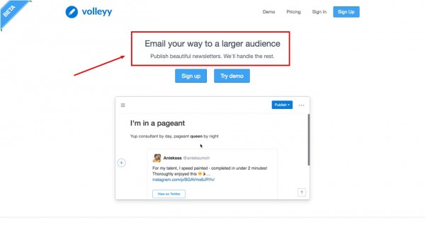
Email your way to a larger audience.
Publish beautiful newsletters. We’ll take care of the rest.
Other than two words “publish, newsletters” this headline isn’t doing much to position the product at all. It won’t grab the customer. It doesn’t solve a problem. It doesn’t really say how this product is different from the established competition.
The first line, “Email your way to a larger audience” is what I’d call “clever or cute”. But what does it actually mean? As someone who has multiple, quite large email lists, it doesn’t resonate with me in any way.
It just sounds like “sales talk” and great sales talk doesn’t actually sound like sales talk, it sounds like a solution to a big problem. 🙂
“Publish beautiful newsletters” sounds straight out of the Apple playbook. What is beautiful about these newsletters? If I lined these newsletters up alongside half a dozen of the newsletters I receive from companies who use Mailchimp, would they in any way stand out as being more beautiful?
“We’ll take care of the rest.” What exactly is “the rest?” If the rest is a problem that the customer has to deal with, you need to clearly state what that problem is.
These couple of lines are the most important in your entire business, they are your sales pitch concentrated down into just a spoonful of juicy goodness. So we need to work on every word until they are the foundation of a product that has real value to lots of people. There’s no room for cuteness, cleverness or irrelevance.
Action: Take your opening positioning statement super seriously. It’s the foundation of your business. It’s a sales pitch condensed into just a few words. It’s the reason why anyone should care about your product and invest more time. It’s the reason you’ll make a profit, or go out of business. Everything else is an expansion on that opening promise.
Forget what you made, how is it valuable?
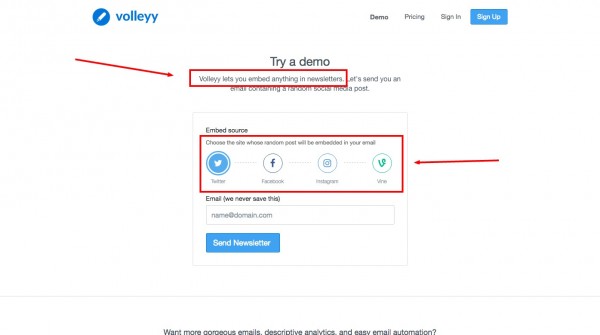
Digging deeper into the site we have a demo page. Now, the demo page seems to make it clearer what the value of this product really is.
From what I can tell, it’s the ability to embed social media posts in an email.
Noddy already shows that on the home page. There’s an animated gif showing the embedding of a tweet in an email. But because it’s presented in the context of a fuzzy, unclear headline, it doesn’t make sense.
Every step has to make sense. A user who doesn’t understand step 1 rarely moves to step 2. They hit the back button. If a user lands on your home page and doesn’t understand your headline (step 1), they may pause for a couple of seconds to try and understand the animated gif (step 2). But if they don’t “get it” by then, the number who will click the demo button to learn more is tiny.
Back to the demo page. The product is explained as:
Volleyy lets you embed anything in newsletters.
OK, “anything” sounds a bit generic, but as I can see the various social media icons, I’m starting to understand. NOW, the animated gif from the HOME PAGE starts to make sense. Now I’m starting to at least see the potential value in this. Maybe this is something that Volleyy can do, that my existing email provider can’t do.
Only after I understand what it is, can I decide if it’s really valuable to me.
We have to get this right first. We have to know how and why we are valuable to our customers. We have to understand the real problem that we solve.
At this stage, I’d suggest replacing that home page header with something like:
Volleyy lets you embed social media posts in your newsletters.
Action: Combine the demo page and home page. Say exactly what the unique value of your service is, in the same place as showing that value, and allowing them to demo it, all in one smoothly flowing sequence. 1, 2, 3.

Who is our customer, what’s the human context for this tool?
Now we’ve established what the real value of the product is…(and I’m only guessing at that from the information available, but I hope my guess demonstrates the principles)…we need to think about who would use this tool, and what the context of that use is. This will help us think from the customer’s perspective as a user. And get out of our own heads as developers and marketers etc.
For the customer to understand our product, we have to see it from their perspective.
That really means getting honest about who would actually use this tool?
There are several pressing problems when building email lists. Building your list in the first place is mostly about what you do elsewhere. How much you hustle and promote your list in other places.
By far, the biggest barrier to list building is the mindset and skill required to not only create, but publish quality content. Very few people have those skills.
After that, getting your emails delivered (not marked as spam) and opened (good headlines) are the biggest real-world problems.
Volleyy does make it easier to “create” and “publish” content, because it’s reusing other forms of content that are quick and easy to create. Tweets, photos and videos etc.
But that’s also potentially a low-value circle jerk. The demo shows someone emailing a tweet about an instagram post.

The reason Twitter and Instagram exist in the first place, is because email isn’t suitable for an endless stream of relatively low-value posts like one-sentence tweets and pics.
What that really means is, very few people are going to build successful email lists when all they post are tweets and Instagram pics.
Volleyy may find ten million people who create tiny email lists, and bug their friends with emailed social media posts. But the question is – how many customers will ever build lists big enough to fall into the PAYING category?
Let’s presume there IS some market for this. Let’s presume there’s a need for emailed tweets, that my brain is too old and addled to understand. (Entirely possible). In that case, we have to clearly identify who that person is, what their lifestyle is, what their BUSINESS is. HOW and WHY they would build a large list based on emailing social media posts.
One group of people that may see the value in emailing social media posts, are “celebrities”. If you’re a Taylor Swift or Justin Bieber fan maybe you don’t mind getting an email a day, to ensure that you didn’t miss out on that killer instagram pic that will add meaning and purpose to your day.
So, maybe Volleyy could target this as a tool for people who are building a fan base, in the music, art, modelling, acting or fitness world. A world where people are creating a LOT of social media content. All day long, on multiple channels, mostly from their phones. And where the ability to quickly send out an email based on their best social media post of the day, via their phone, may be a real benefit to them.
If we focused on this market, we now have a bunch of people we can SHOW in our marketing. Attractive, talented, creative people. We now have a world we can tap into. We now have a community we can target. Our “app” is becoming more human.
And instead of trying to stir up interest from the general masses, we can target the cream of the social media creators. The young and talented, those “on the rise” on each of the social media platforms.
How might we change that positioning headline, now we have a specific market?…
Volleyy lets you email your best social media posts to your fans, quickly and easily from your phone.
That would need some refining, I’m doing this on the fly, but we now have a complete story. A story in which your product solves a specific problem for a specific type of person, in a specific context.
Imagine the promotional video you could create. Up and coming musician/model/actor who takes 30 snaps/pics/tweets a day, emailing the ONE that got the most attention, via email, on their phone, in just a few clicks to their email list.
Action: If your threshold for getting paid is people with a list of 2000 email followers, you need to target people who have any chance of building a list of 2000 people and who want to receive the type of email your product is designed to create. Narrow the market, pick a niche, then you can incorporate the human aspect into the technical solution. Selling is about people.
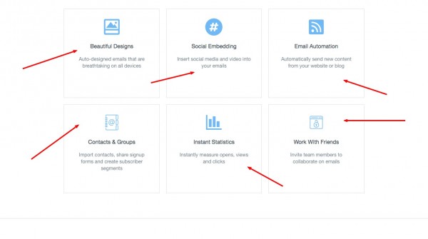
The problem with feature boxes.
There’s nothing wrong with making a list of features in the planning stage. Then working out what the real benefit of those features is.
You may discover that you magically have 6 really important features / benefits that conveniently fit those 6 iconed boxes. But it’s unlikely.
Which means, if you’re using a 6-box feature panel, you’re not prioritizing benefits in order of importance to the customer. If you can achieve just one thing that’s genuinely helpful and different than your competitors you’re winning. If you can do two, you’ll kill it.
In this case, maybe the number one thing is that you can embed social media posts. And maybe the second thing is that you can do that really quickly and easily (as few keystrokes as possible) from a mobile phone? If the real value of this product is something else, it hasn’t been demonstrated convincingly yet.
Action: There are formulas, rules and patterns to marketing. But it isn’t painting by numbers. Don’t just fill in the blanks on templates because they exist. Or copy what everyone else is doing. When it comes to the features and benefits of your product highlight what’s really important to your customers in depth, and downgrade the rest.

Only compare things that the customer really cares about.
Everyone loves a 3-column comparison table where you have all the big green ticks and your competition is trailing woefully behind. That stuff is cool if you’re selling a commodity and any additional feature adds value. But that’s not the profitable end of the pool.
If you do try to go head-to-head in a comparison, you have to do so with features that people really care about. If you don’t, you’ll damage your pitch by insulting their intelligence.
Is “Automatic email theming” really at the top of anyone’s Christmas list? Is “building without drag and drop”? And comparing Yahoo and Gmail to Mailchimp seems like comparing apples to spaceships.
The goal is not to have the longest list of ticks. It’s to have one or two ticks that one group of people really values.
Action: Do a side-by-side comparison demonstration of something real and valuable. Let’s imagine that one of your users can email an Instagram post to their list in 10 keystrokes and in less than 30 seconds on their mobile phone with your service, compared to the 25 keystrokes and 90 seconds it takes on your competitor’s site. Demonstrate that in a side-by-side video. SHOW THEM how you lead in something valuable.
A gorgeous word about Apple.
Every generation is influenced by the big marketing successes of the time. Which is why it’s useful to learn marketing from a historical perspective. We are the generation brainwashed by Apple.
“Publish beautiful newsletters…want more gorgeous emails?…”
But adjectives like gorgeous, beautiful, captivating etc. are not the reason Apple became Apple. They are the cherry on top of real problem-solving solutions. The “1000 songs in your pocket” iPod may be gorgeous. The “Internet in your pocket” iPhone may be beautiful. The “lightest laptop in the world” MacbookAir may have been captivating. But they were all real solutions to real problems, first and foremost.
Action: You should always know what that real problem is that you’re solving, first and foremost. Beautiful adjectives are just garnish, best not used until the main dish has been thoroughly practiced and mastered.
[userpro_private]
Names are really important.
Especially for low-value products that require a high volume of people (lots of word of mouth).
Volleyy is something of a word puzzle. People don’t remember word puzzles.
The number one purpose of a name, is to help customers remember you. For people to remember the name Volleyy they have to remember something like “it’s called volley, like volleyball, but with two y’s.”
And once you change the spelling of any word, it also makes it harder to remember how the word is spelled in the first place, so people will be asking themselves if there is one ‘l’ or two ‘ll’s’ in volley.
So, the mental conversation that has to happen to remember your name is “it’s called volley, like volleyball, it’s an email thing, it has two ll’s and two y’s. vo-ll-e-yy.”
That’s requires too much brain power. People won’t remember it, so they won’t refer you to their friends.
Action: Consider a simpler name. Minimal syllables. Relevance plus some kind of novel image that’s easy to picture. “Mailchimp” is a superb example.
[/userpro_private]
Summary.
The big question behind any successful product is “who is my customer and what problem are they so motivated to solve that they will pay for my solution”? Finding and highlighting what motivates them is key.
As developers and engineers, we often start with a technical feature or tool, which can be fine. A lot of extremely valuable solutions started off as accidents or experiments looking for a problem to solve.
But once we have a solution, we still have to find the right audience for it. The right people. And we need to speak their language. Before our tool becomes a profitable product.
At every stage we have to really dig deep and ask…beyond the technical solution we have created, what is the unique problem we’re solving for other people here? And do they really value that solution enough to pay for it?
I want to thank Noddy for sharing his work and helping everyone learn from the process, I really respect what he’s doing. Until next time, stay the course, see it through, make your mark!
Paul.
![]()
Today I’m looking at Nick’s website Codecombat.com He’s got a Y Combinator backed start-up that’s helping kids learn programming through games. Let’s dive in and see what we can learn…

1. Enough clarity to continue, logically and emotionally.
I love what I see right away. Whilst the opening promise, or headline, doesn’t quite roll of the tongue, it does give me a very clear idea of what this place is all about. “The most engaging game for learning programming.”
I see a lot of random adjectives thrown around on landing pages, “The fastest, the cheapest, the bestest on the interwebz”. But when you’re a teacher trying to get kids to focus, “engagement” is probably your biggest problem. And honing in on the biggest problem is exactly what that opening promise is all about.
But what I love even more is that there’s a big human image accompanying the promise and the image communicates the exact same message as the headline. You can see, and your brain can “feel” the happy, engaged kids. Happy kids = happy teachers.

2. Make the aesthetics congruent with the key idea.
The only improvement I’d make is to work on your color scheme. If you applied the word “engagement” to the overall aesthetic, you’d end up with a slightly different color palette. That great image has a dark filter over it. We’ve essentially sucked the color and some of the life out of it.
Our brains encode images in all sorts of interesting ways. Those “pictures in our mind” determine how we remember things. And how we remember things is how we think about them.
We’ve seen over several of the recent tune-ups, that people who are skilled at thinking in a technical manner, will often be very engaged with the technical aspects of a product, but less engaged with the human aspects. So, we see big screenshots of computer screens but tiny images of human faces.
When your job is staring at a computer screen all day to create amazing new products, that’s exactly how you want things. But when the task is connecting with the humans on the other end of a sales conversation, we have to change mode.
As well as the size of an image, and the shape of the image, we use color to store images in our memory. Think about this for a second – how do you know that a memory is a memory and not a dream about a future event that has yet to happen?
One of the common ways we know a memory is a memory is because we color it differently. Memories tend to be dull, or black and white, at least initially. We don’t think about this consciously, we just “know” it’s a memory and not something else.
So, when it comes to setting the “tone” for our aesthetics, if “engagement” is the vibe we’re trying to communicate, then I’d recommend turning up the vibrancy. Lose the dull color palette, change the image filters. Turn up the color. Bring people out of the past and into the present. In the present, the time when we’re really engaged, everything is about as bright and shiny as it gets.
Of course there’s a real skill to aesthetics, a professional skill. So, once you really understand what you want to achieve, it can be worth the time and cost of having a designer with an exceptional eye spend the many, many hours it takes, to find and manipulate those half a dozen images that will perfectly communicate the human feelings behind your pitch.
Because when you get it right, your idea and its value will just make more sense, unconsciously, to your customer. They won’t be able to tell you why, they’ll just feel like it all makes sense.

3. Who are the individual players, what can they do here?
It’s great to have the most important call to action above the fold. But the 3 buttons and their descriptions aren’t particularly clear here.
Is the play button really a “Demo” button?
The “Join class” button leads to another login page which itself is just as confused and seems to be in the middle of some transition.
This is where the customer starts having to suffer the realities of developing. And we don’t want that. We want clarity, with very little thinking. Decisions that people can’t really screw up.
The third button says:
Teachers & Educators
Learn how our classroom-in-a-box platform fits into your curriculum.
But the button doesn’t seem to be taking them to a “learning” part of the site. The “learning” part of the site seems to me to be the marketing copy directly below. And that link is for people who already understand the pitch and want to get actual lessons set-up?
Define the path by the person taking it.
If you’ve got different types of people using your website, the most useful way to organize that website is around the PEOPLE, not around your functions and features.
In this case, we’ve got at least 2 distinct groups. Kids/Students and Teachers.
But in this market, I’m sure there’s likely to be a third group, I’ll call them “Administrators” for now.
When we’re doing our job right, the Kids are tugging at the trousers of the Teachers, saying “please Sir, buy CodeCombat” and the teachers are tugging on the trousers of the Administrators saying “please Sir, can we buy CodeCombat”.
Beyond those 3 groups, you may even have an important 4th party, Parents. Parents can be supportive, or parents can be disruptive, so you better have a plan for persuading and convincing them that their kids “playing more computer games” is a good thing, and not the beginning of the end.
So, how do you eat the 4 elephants in the room? One at a time.
I’d keep the big happy kid picture and the opening promise / headline, then I’d identify and silo those different parties off onto individual pages that apply and speak only to their unique interests.
STUDENTS – PARENTS – TEACHERS – ADMINISTRATORS
Below each header (and you can maybe include a small image representing each different party), reinforce the unique value that you represent to each group with a single sentence…
STUDENTS
Learn programming by playing games.
PARENTS
The language of science and success, now available to every family.
TEACHERS
All your computer science lessons covered (even if you’ve never taught tech before).
ADMINISTRATORS
An affordable way to raise computer science grades in your region.
(I’m making these up off the top of my head. Yours should reflect whatever is the most important point you want to communicate after having thoroughly worked out the long-form sales pitch for each group).
Then, give them one or two very clear ‘call to action’ buttons each. They either want to start using the product if they are already familiar, or they want to “learn” what it’s all about if they are new.
Think about it, your marketing site is a sales pitch. A sales pitch is just a persuasive conversation. If you had a kid, a parent, a teacher and an administrator in the same room, they’d all have totally different perspectives and concerns. You’d have the best chance of convincing them all, if you spoke directly to each of them individually about their problems from their perspective.
You’ve already attempted to do this, we just have to go all the way.

4. Don’t undersell.
One of the advantages of creating different pages for different parties, is that you now have the space to go deeper into really selling each important point you want to make.
I think the copy on the homepage is better than average and hits a lot of the right notes. There’s clearly a connection being made between the product and the human emotions that people actually care about. Let’s look at a few…
Our courses have been specifically playtested to excel in the classroom, even by teachers with little to no prior programming experience.
From the Teachers perspective this is really important. There are lots of teachers who end up running a class that is not their area of expertise. They’ll be feeling totally out of their depths. So by making it clear that this is for people with no prior programming experience, we’re solving a major problem.
Remember how we determine what’s important to people? It’s not our features, it’s “what keeps them awake at night?” Can you imagine a teacher being told “you have to take this computer class next year” with no prior experience? Can you imagine that teacher having some sleepless nights over it? I can. And I bet it happens all the time.
So give it the space it deserves. Go deep into showing how you remove that pain for inexperienced teachers in a pitch devoted just to them.
Democratizing the process of learning coding is at the core of our philosophy. Everyone should be able to learn to code.
These days, coding is being talked about in the same way that “learning English” used to be talked about, in countries around the world, by parents who wanted their kids to have more opportunities in the future. There’s a genuine, and very positive movement to level the playing field, and see those who are willing to study and act, succeed. Above and beyond how lucky they were to be born in one area, or another.
This kind of thing really can be part of a wider movement that makes the world a better place for us all to live in. So, sell the shit out of it! Tap into those positive emotions. Martin Luther King didn’t make change with a 3 minute speech full of one line bullets. He spoke for 17 minutes.
Studies suggest gaming is good for children’s brains. (it’s true!)
When game-based learning systems are compared against conventional assessment methods, the difference is clear: games are better at helping students retain knowledge, concentrate and perform at a higher level of achievement
I’d recommend never qualifying a statement with “It’s true!”. It makes your argument sound weak. In fact, when people aren’t telling the truth, they often start their sentences with “To tell you the truth…”
That isn’t to say that you shouldn’t pay attention to the concerns and cynicism of your audience. I’m sure that some parents (especially as you expand beyond the tech world bubble) will question the validity of using games to teach “serious” topics. And it’s OK to acknowledge that in your copy and reply to it directly. You don’t need to pretend that no one ever says anything negative. Just state your persuasive argument without over qualifying it.
A classroom in-a-box for teaching computer science.
What is a classroom in a box? I think I know what you’re trying to get at here. You’re appealing to the same teacher who isn’t necessarily a computer scientist themselves, and they just want a “one stop” solution. Buy it and it takes care of everything.
But I’d prefer to see you lay that out, in full, so that those teachers really understand it. Everything does not have to be tweetable. When we condense our selling point too much, they become cliches or worse, incomprehensible. Clever, or cute, is somewhere in-between. Where we kind of know what it means, but don’t really feel it deep down.
You’d have to have more conversations with your teachers to find the right combination of words. To hear the problem from their angle, before you could come up with a better headline. I don’t know if a teacher thinks: “How am I going to fill X hours per week with computer science this year?” or whether they think “How am I going to get through teaching two years of computer science?”. But there will be some metric, some hole they need to fill. Once you better understand the nature of that hole, you can fashion a better peg to fill it.
So, rather than saying “A classroom in-a-box for teaching computer science” you might say, “Absolutely everything you need to teach computer science twice a week for the next 3 years. (Even if you haven’t taught it before).”
The main point is, try to sound human and specific, rather than clever or cute.
[userpro_private]

5. Kids listen to Kids. Parents to Parents. Teachers to Teachers. Administrators listen to everyone.
It’s great that you’ve included a few testimonials. But once you split the pitches, you can go all in. Testimonials are good. More testimonials are better. Testimonials that turn into case studies are the best.
Kids should be recommending to other kids. Parents to other parents. Teachers to other teachers and Administrators to other Administrators.
And nowhere will you need to stack your proof more than when pitching to administrators. And I suspect it will be administrators who have the final say in purchasing this product. Maybe for entire districts, or even on a state wide level. So, you better get your pitch to Administrators spot on. And that means proving that everyone in the world loves and supports this product.
More important than our words, are the words of our customers and users. You’ll have to stack those testimonials and layer that proof for the Administrators. Kids love you, parents love you, teachers love you. Not one or two random people. All of the people, everywhere. They all love you (it’s true!!) 🙂

6. The team and the mission is a part of the overall pitch.
I love the passion that starts the About page…
Programming is magic. It’s the ability to create things from pure imagination. We started CodeCombat to give learners the feeling of wizardly power at their fingertips by using typed code.
As it turns out, that enables them to learn faster too. WAY faster. It’s like having a conversation instead of reading a manual. We want to bring that conversation to every school and to every student, because everyone should have the chance to learn the magic of programming.
I love that, but I’d prefer to see that passion, and the team themselves, woven into the pitch itself, not just hidden away on the About page.
Having gaming avatars or icons may be appropriate to this particular product, but it creates a barrier when it comes to trust. Humans prefer to do business with other humans. Not wizards.
I’d much rather see a page full of real, smiling human beings.
When you hide your face you lower the levels of trust. People unconsciously think you have something else to hide. Remember, this is first and foremost a selling environment, not a playing environment.
We can always make it so that you can roll over the real head-shots to reveal team members avatars underneath. But trust should come before fun.
[/userpro_private]
Summary
This is definitely a site that’s doing more things right than they are wrong. I’d split the pitches up, so you can talk specifically to the different needs of the different parties involved. That will allow you to do deeper into solving their individual problems and providing lots of social proof in the form of testimonials and (over time) case studies. The existing copy is good, but it’s just the tip of the persuasive iceberg. I’d also make sure to include pitches for Parents and Administrators.
Just as the games themselves are colorful, don’t make your marketing aesthetic dull and distant by comparison. Dial up that saturation, that intensity of color, especially in the human images. As you create the individual pitches, reduce the number of generic icons and replace them with more relevant human images.
Marketing, just like coding is a complex process. But it does follow rules. Rules governed by the human personality. Piece by piece, person by person, we can work out how to communicate in the language that makes our customers move through that maze. Collecting Scooby snacks as we go. That’s magic as well!
I’d like to thank Nick and the CodeCombat team for sharing this with the community, so we can all get a little smarter. Until next week, stay the course, see it through, make your mark!

This week I’m looking at Sunny’s website Tenjin.io They’re a 7 person Y Combinator start-up, selling an analytics tool. They help people who are promoting mobile apps, to make better decisions about where to spend their advertising money. Let’s dive in and see what we can learn…

1. Is the most important thing you’re saying, the most important thing?
The homepage opens with a large bold promise…
Attribution, Aggregation, and Analytics for a single price.
Let’s imagine for a minute that we understand what “Attribution, Aggregation, and Analytics” means. The second part of the headline is implying that the real problem we have with “Attribution, Aggregation, and Analytics” is that we’re being charged “lots of different prices”.
But I’m going to bet that none of Tenjin’s customers lie awake at night thinking “If only I could get my attribution, aggregation and analytics for a single price, I’d finally be able to sleep!”
And that is really what we should be trying to achieve.
You literally want your ideal customer to say to themselves “Finally, just the solution I’ve been looking for”. So it has to be a solution to a real problem. Not an imaginary problem.
There should be enough words in that opening promise that it makes sense. But not a single word that isn’t communicating a solution to the most important problem.
Which leads into…
2. Your headline is the last thing you should write.
Writing a sales pitch is a detailed process. And a website is just a sales pitch, on the web.
You have to understand your customer from a lot of different angles. And then you have to understand how your product solves their problems.
Now, there’s a process to do that, and it requires some preparation. Just like a chef preparing a fine meal has to start with good ingredients, a marketer has to start with good questions.
Questions like … What is the most painful problem? Why hasn’t the problem already been solved? Why is it not the customers fault? What would an ideal solution look like? What’s the hidden emotional need? etc. etc. These are the raw ingredients for a marketer.
When you work through the process of preparation, listening to your customer to really understand the answers to these questions, you end up with what is essentially a long-form sales pitch.
You can turn that long-form sales pitch it into a sales letter, or a presentation, or a blog post, or a face-to-face conversation.
But you really have to master that long version of your pitch first, before you even think of trying to communicate it in a few words.
Start-ups are usually quite good at doing this, in person, already. You need to have a good pitch in order to get started in the first place.
But somewhere between the real-world enthusiasm of the founders and the marketing website, things get lost in translation. The passion is removed and the technical language and abstraction creeps in.
What we must do is go back to the kitchen. Go back to our raw ingredients. Go back to the fundamental human truths. Go back to our long-form pitch – then concentrate the juices to create our shortened headline or opening promise.
In a person-to-person meeting it might take you 15 minutes to tell a story which fully communicates your value. Once you’ve mastered that, try boiling your pitch down to a 3 minute story. “Bob works for a mobile app start-up. Bob’s job is marketing. He’s trying to promote his companies app across all the different advertising networks. But every day Bob struggles with…” You get the picture.
Once you’ve perfected your 3 minute pitch, work on a 30 second pitch. Now it gets harder, because we get tempted to rely on buzz words and acronyms to save time. But that usually comes at the cost of understanding. The skill is to keep condensing your story until you have the 5 second version, which is just a couple of lines, but it STILL maintains the core essence, the core value. It still clearly tells a human story of real problem and real solution.
It still makes the right person say “Finally, the solution to my problems!”
3. Human Stories not Buzzword bingo.
After we’ve really captured our customer’s attention, by concentrating the most important aspect of our long-form sales pitch, we can move to the next phase. Now it’s time to expand the human story and incorporate our product into the narrative.
Only when we’re telling stories do we get to position ourselves as the “wizard guide”. Remember, it’s the customer, not us, who is the hero.
The website should unfold around a story about their world. A story they understand because they live it every day. The story shouldn’t unfold around our technology. They don’t understand our technology and they don’t want to. They just want to solve their problems.
Right now, the Home page is a list of buzzwords, that require explanation. But those explanations just use more buzzwords to compound the abstraction.
There isn’t a single human being on the Home page. There isn’t a single, genuine human emotion. There’s no empathy, so there’s no real connection.

4. Why Do We Find It Easier To Sell Ourselves To Employees Than Customers?
Here’s an interesting thing to ponder. I often come across dry, technical websites but find far more readable and relatable copy on the Vacancies page.
I love how fun and inviting and human the image of the Tenjin team is above. But it’s on a jobs page that’s hidden away. Why are we comfortable being human and projecting warmth and fun to potential employee’s but not customers?
Customers are people too!
First of all customers need to understand the basic value we can offer them. That’s where the stories come in. But secondly, and just as important, is that customers get to know, like and trust us as human beings. Because people want to do business with people they can relate to. As small companies trying to compete with faceless corporations it’s one of the few advantages we have.

5. What do you stand for, what are your values?
What binds people together are shared values. Ideas that we feel compelled to move towards, or away from. When we share our values, and those values align, we trust one another.
The human personality hates unpredictability. But with any new business relationship, unpredictability is a part of the process. To deal with the unpredictability we imagine the worst – what if something goes wrong? How will these strangers respond?
It’s safer for us to be overly cautious. If we can avoid danger, we will. Especially when we’re spending money and risking our reputation within our company. The default position is always “no sale”. That’s just how our brains are wired to work.
So, it helps to share our values with our customers. Give them the raw materials their imaginations need to predict the future. We need to make ourselves more predictable and therefore less risky.
A good About page is the start of this process and it’s great to see smiling human faces on there. More personal information will always help. But right now I want to touch on the overall corporate values.
The company name is Tenjin. Using an unfamiliar word is fine, but you’re going to have to spend resources to get that name to stick in people’s minds. So, if Tenjin is the name we have, how do we help people remember it? How do we make it mean something, anything, to our customers?
There’s clearly an Asian connection going on with this company. And Tenjin reinforces that. So why not go all in and position yourselves fully around that.
My quick Google search tells me that Tenjin is a Japanese Shinto deity. Representing both the scholar and the poet. (Now, this will all be very embarrassing for me if you named the company after some other Tenjin that I’m not aware of, but I will proceed anyway…)
Just with those two words “scholar, poet” you dramatically make the overall brand and name more meaningful and appealing. The scholar represents the data, analytical, technical side of your story. The poet, represents the human, emotional stories you need to become a part of.
I’d love to see that history, that culture, communicated as part of the corporate brand on your About page. Alongside a couple of lines from each staff member which add to the list of positive values that mean something to your employees as individuals. And I don’t mean “I’m a coffee lover from XYZ”. Let your customers in, connect on a genuine human level.

6. Use as many words as it takes.
I’d recommend moving away from this idea that you have to sell in tweetable one liners. Having one tweetable description of your product is fine. But having a website full of nothing but one liners just isn’t going to be persuasive.
We’re not selling a $5 impulse purchase, in a one-click shopping environment. This is a product with a substantial monthly price tag. So, any feature or benefit that we deem valuable has to be really sold to the customer, in detail. You’re far more likely to not say enough, than you are to say too much.
In the “blog” section, there is just one post “Building for the marketing scientist“. Now it’s not even a very long post, but it actually explains what the company is trying to achieve better than anything else on the website.
This is more like the sort of thing that should be on the homepage. This is the sort of writing that makes the whole idea make sense.
And within that blog post there is a hint towards something else that’s very important. It says…
At Tenjin, our mission is to create a service based platform for marketing scientists. At Tapjoy and Playnomics, I witnessed the struggle marketers face organizing big data in spreadsheets. My co-founder, Amir, and I built Tenjin so that mobile marketers could spend their time analyzing data, not wrangling it. If you’re a marketing scientist (or one in the making) we’d love to hear from you.
The key phrase for me is “If you’re a marketing scientist (or one in the making) we’d love to hear from you.”
The reality is that most of your potential customers, (whether they admit it or not) will fall into the category of “marketing scientist in the making”. In the making. Not 50 year masters of their craft. Because the craft, in this form, didn’t even exist, just a few years ago.
So, most of the people who can benefit from this tool, will be muddling along. They will be trying to sound knowledgeable, but half of the buzzwords everyone uses, won’t actually mean anything to them on a deep level.
Once we know this, we can change how we speak. We can move away from trying to sound smart and technical and like “experts”. And we can move towards creating deep understanding and really helping our customers do their jobs as well as possible, as “partners”.
7. Social proof.
Logo’s aren’t enough to generate trust. We need to link those logo’s to the real people in the real companies behind them and weave them into our site in the form of human faces, human problems and human case studies. Interviews with the actual people who have already used the product, not only help us tell better stories about our product, they help us understand the people we’re serving in more depth.
Starting a company to “scratch our own itch” is fine and a great way to begin. But the moment we do that, or the moment we get funding and have to add a big price tag, we instantly lose a lot of that perspective and empathy. We’re no longer our own customers. We’re now running a company, with a whole different set of challenges that the one we originally set out to solve with our product.
So we have to constantly keep a check on the accuracy of our assumptions about our customers. And case studies not only help us do this, but the more we can use our customers’ own words to sell our product, the more convincing our pitch will be.
Summary
Everything starts with the long form sales pitch. The most human version of your story. The one where you identify the person, the problem, the struggle, the goals and how your solution fits them like a glove. Everything else is a process of concentrating that pitch into shorter and more concise forms without losing its human essence.
The danger is allowing the scholar to drown out the poet. Thinking that sales decisions are made using reason and logic. But they are not. It is the “poet” in us all who is motivated to buy. The “scholar” merely comes in to justify the decision that has already been made.
I’d like to thank the guys for sharing with the community, I really respect what they’re doing. Until next week – stay the course, see it through, make your mark!

This week I’m looking at Fred’s website rainforestqa.com He’s part of a Y-Combinator start-up, helping companies test their websites and apps to avoid embarrassing bugs. What I love about these guys, is that while I’m making my notes (and before I could do screenshots), they’re already running experiments with better copy. So, I’m going to take this opportunity to talk about one particular idea that comes up in a lot of tech start-ups…

You keep using that word. I do not think it means what you think it means.
The first thing I noticed when I scanned the homepage was the level of technical language, and the number of acronyms vs the number of human faces.
We often overestimate the value of technical terms and industry jargon. But they can really damage our sales, and in this situation, selling is what we’re trying to do.
There’s a big difference between “kind of understanding” what something means and really comprehending what it means.
And further than that, there’s a difference between comprehending what something means and really feeling it on an emotional level. Feeling it enough to take action.
We make a number of mistakes when it comes to using jargon.
First of all, we presume that the person scanning our sales material will instantly understand the phrases that we spent days or weeks pouring over. Meanwhile, there’s a good chance they’ve never even heard of the technology or method that we’re trying to explain.
We presume that the person we’re trying to sell our technology to, is a lifelong master at the job he or she is doing. “Of course they will understand all these acronyms, they’re common in our industry”. But most people are not cruising through life as dedicated masters of their chosen profession. Most people are actually muddling along. (Even the smart folk, even the folk at the top.)
Most people are not certain at all about half the industry terms they hear. Terms being thrown around by the press, writers, consultants and talking heads.
Half the stuff we’re talking about today didn’t exist 10 years ago.
Consider this – half the people you’re trying to sell to, didn’t hold the position they have 3 years ago. They are working in companies that hadn’t been started 5 years ago. Often in industries that didn’t exist 10 years ago.
And even if you do really understand your customer – the engineer or expert who lives and breathes your technical language – they aren’t going to be the only ones who have to approve your sale. There’s a good chance that their manager or CEO will be more people-focused and less technical in outlook.
There may be several people who are part of the decision-making process. People who will want to scan your pitch, and quickly understand its value.
For 20, 30, 40 years those human beings – the people reading your pitch – will have been using a certain number of simple words every single day. They comprehend those simple words on a deep level. But then, when it comes to selling our products, we often pull out the “Sunday Best Words”. The fancy words we use when the Vicar comes for tea. The words we think make us sound smarter. Or worst of all, the words we just invented to sound like we’re so smart that we can invent our own words!
But our job isn’t to sound so smart that our customers get left behind. Our job is to sell.
And that means our job is to communicate a problem and a solution. In such simple terms that not only do they comprehended it, but they feel it. They feel it in their gut and that feeling creates action.
So what do we need to remember when writing our copy?
- It’s not a competition to prove how smart we are, it’s a competition to understand our customer deeply and tap into existing feelings.
- We should make our user feel more intelligent in our presence, not less intelligent.
- We have to presume our user has just landed in their job position and our role is to help them excel at it.
Always start a conversation with the most basic definitions.
For example, I’m a marketing guy. I work with people from around the world. Many of them consider themselves to be life-long marketing experts. Many of them are famous marketing teachers. But despite all that experience and expertise, they all use completely different definitions for the word “marketing” itself!
So, whenever I sit down with someone (whoever they are, and however long they’ve been in the industry), I define for them what I mean by the most basic terms I’m going to use. Starting with “marketing”. And I tell them why THEY should give a damn about it.
It never fails to create more clarity, trust and a deeper understanding of how we can work together.
Always dig down until you find the relevant emotion.
Especially when you’re selling technology, it’s easy to think that you’re in the technology game. But you aren’t in the technology game. You’re in the problem-solving game. And if you dig down beyond the abstract terms like “Quality Assurance” and “Continuous Development”, then you’ll find a human problem. And with human problems come human emotions.
A “negative” emotion is the brain’s way of shoring up an inadequate skill set. Wherever you find the emotion, you’ll find the opportunity to help. The opportunity to create value. The opportunity to make a sale.
In this case, the real motivation – the feeling that will actually drive people to act – is likely something closer to avoiding the embarrassment that comes from making mistakes. Now, don’t take my word for this, because I haven’t done the work to understand your customers on a deep level, but this might help illustrate the process that you can follow yourself.
People do “quality assurance” so that they don’t release sites full of “bugs” … which customers will “complain about” … which will make them feel “less skilled” and “less valuable in the community” … which causes the sense of “embarrassment”, a mild form of “shame”.
Make no mistake, you’re in the “avoiding embarrassment business” not just the “quality assurance business”.
And whenever there’s an emotion that some people will be driven to avoid, you’ll also find a mirror emotion, that other people will be drawn towards. Most people avoid pain, some move towards pleasure. But it really depends on the product, the market and the type of customer.
Either way, the technology is really just a way for them to feel an emotion. So, you have to really know what those emotions are and you have to put them upfront.

Ease into the acronyms.
Imagine that our customer is a super smart engineer at the top of their game. But that engineer has to get their CEO to sign-off on our technology.
Our goal is to have that CEO feel the need for our solution on a deep level. Not to make him think, not to make him feel dumb.
So, if you must use jargon, educate him as you go.
I’d say something like…
“You know that Quality Assurance (QA) is really all about catching the bugs before you launch. We all want to be proud of the products we’re producing and avoid the embarrassment that comes with breaking the website…”
Now, that copy isn’t going to win any awards, I’m just trying to illustrate the idea. Instead of diving into just using the acronym “QA”, we’re reminding them that “QA” actually stands for “Quality Assurance”. AND we’re reminding them why they should care about Quality Assurance. On a deep, personal, emotional level.
Personally, I’d try to avoid all but the most basic acronyms entirely. They almost always add a level of abstraction to your sales copy that’s going to hurt. But if you must use them, remind your reader, two or three times, what the acronym really means, before using just the abbreviation.
Let’s look at this emotional stuff in a bit more detail.
We have to remember to link the features of our technologies, to the very human benefits that people are going to experience.
Don’t forget it’s people who buy stuff from other people. And they buy stuff because they want personal benefits. They want their boss to pat them on the back and increase the value of their share options. So they can buy a better house for their wife and kids, and feel like they finally proved their value to Mom and Pop.
Your customers do not lie awake at night worrying about things like “QA-as-a-service API’s”.
They worry about their ability to execute their job because it gives them a sense of value. They worry about their standing within their family. They worry about what the neighbours think. They worry about their position in the wider community. They feel like they’re constantly having to make decisions about things they only half understand.
So, help them. Be their friend. Be their ally.
We have to go really deep into understanding who each of our customers is, and what their personal motivations are. We have to go all the way to the murky, emotional bottom. I know that we often think they are intelligent, educated professionals, who make logical decisions based on rational thought. But they are, in fact, human beings.
Copy tweaks.
Let’s look at a copy example that ties some of these ideas together.
Here’s the original headline and sub-header of the homepage as I made my initial notes…
Fast and simple QA
We automate your functional and integration testing with our QA-as-a-Service API. Human testing at the speed of automation.
Here’s the direction I’d start testing in…
Rainforest makes it easier to launch bug-free websites and apps.
Tap into 50,000 sets of human eyes. Catch bugs early, launch proud and avoid embarrassing mistakes. It’s Quality Assurance in plain English.
Now, as I mentioned earlier, before I got a chance to do my screenshots, Rainforest (without any communication with me) changed their homepage headline and title. That’s great. It’s shows they’re continuously testing. And I think their new test, which may be one of many, is a step in the right direction. (But is still going for short and clever over long and clear). It currently reads..
Deploy faster without breaking things
On-demand, human testing at the speed of automation.
OK, let’s point out a few things I think Rainforest are doing well, with minor adjustments to make them even better…
Website Environmentalism.
I love that there’s a real picture of an actual customer alongside the testimonial on the homepage. I’d love to see more of those. A lot more.
Every time you remove an acronym or a jargony word, you improve the environment a little bit. But to make it flourish you have to also plant lots of faces. Faces are like blossoming trees in the desert.
It’s interesting that even in testimonials, people increase the technical nature of their language, unless you encourage them to do otherwise.
Testimonial collection is a serious business. But when asked to sit down and write something, especially when we know it’s related to selling, we often start using those “Sunday Best Words” again.
Encourage people to tell you “in plain English” what they think of your product and the benefits they’ve received. You’ll not only get more natural sounding testimonials, but you’ll get an insight into what people really value.
[userpro_private]

Add a human interest element to your case studies.
I also love that you’ve included case studies. But bring them to life with images of the characters who were involved. Remember, it’s people with personal problems who want to see case studies of other people just like them, who solved those problems. It’s not really about products or companies or processes. It’s about human stories.
When developing the case studies, you really want to tap into who the key players are. The developers, the marketers, the founders. What were their individual worries before you came along? What were they surprised to discover working with your service? And how did it impact them personally in the long run? Think like a journalist, telling a human interest story. There’s a good example of that in a previous tune-up featuring openlistings.com
The About page is a key resource.
I like the About page, and it’s frequently one of the most important parts of the trust-building process. So, make sure it’s in the flow of the main pitch and not just hidden at the bottom of the page.
As an experiment right now, go look at the homepage, above the fold, which has zero human faces, then look at the About page, which is bursting with happy, smiling, real people.
Which makes you feel more engaged? Which builds your trust?
Even having the world map helps orient this company in the real world. It helps make virtual ideas more concrete. (If you happen to have nice offices, pictures of those also help increase the sense of trust that’s essential to doing business with any web-based company).
[/userpro_private]
Summary: What comes next?
A lot of the technologies win because they’re first to market. But that’s rarely an advantage that lasts for long.
It’s always worth thinking about the long-term plan as well. What else have we got? When the polish has worn off and there are a half-dozen competitors in the same space, why will people stick with us?
That’s usually a human element. A matter of personality, of character. Trust. Support. A deep understanding of the customer and their individual needs. And that is something which has to be developed, practiced and most of all experienced by your customers over time. So, it should be baked in there from the start.
I don’t quite feel that yet. I see an understanding of a technology and a process. But I don’t see or feel an understanding of the people who will be using it on the other end.
Knowing your customers deeply is hard work. But it’s really the only long-term game.
Owning a place in your customer’s mind requires a deep appreciation of who they are, and the struggles they face. Only then can we make products that really change their lives and help them achieve their very personal, very non-technical life goals.
That’s what marketing is really all about for me.
This one was all about the details. Overall, I really respect what these guys are doing. They’re testing, adapting and actively seeking solutions, so I’m excited to see how they develop.
Until next week, stay the course, see it through, make your mark!
More Y-Combinator Tune-ups…
What’s At The Heart Of Your Website? A Technology, Or The People Who Will Use It? (hellobonsai.com)
It’s All About The Feels. A Website Marketing Tune-Up To Hack The Housing Market. (openlistings.com)

This week I’m looking at Matt’s website hellobonsai.com He’s a Y-Combinator start-up, helping freelancers get paid faster, with less stress along the way. Some people like to call these teardowns. But I’m not a big fan of the term. The people who ask for my feedback are smart and willing to share with the community. I really respect what they’re doing and I’m here to support them. So, I much prefer the term “tune-up”. Let’s dive in and see what we can all learn.

1. Leading with the problem often commands more attention.
So, I land on the home page and I’m greeted with the standard summary of “what we do” comprising a headline and sub-header.
Peace of mind for freelancers
Bulletproof contracts, e-signing, & integrated payments.
Get peace of mind & get on with your work.
It’s not bad, it’s identifying the target market. And it’s telling me that I can find help with contracts, payment tools and “peace of mind”. It all sounds very pleasant.
This initial description of “what you do” and “where your value lies” is critical. And it’s really a boiled down version of your overall sales pitch. So, every word counts. Here’s how I’d start testing alternatives for more effectiveness…
First of all, it often helps to start with the problem, not the solution. There’s a reason people are reading your pitch in the first place. They have a problem and they’re hunting for a solution.
People who don’t have problems. The guys who are already “getting on with their work” and loving life. Those guys aren’t the ones reading your pitch.
It’s the people who are suffering the most, who are going to invest time in learning about your offer. So, speak to their pain. Show them that you understand their problems. Identify the issues that will naturally grab their attention. Only after you have their attention and you’ve shown them your solution, does it make sense to paint a picture of that “better life” they’re going to be living.
Right now, the thing you’re highlighting is really a features list – contracts, e-signing, payments. The interesting thing is, deeper down in this site, you already have all the copy that you need to grab your reader’s attention. It’s really all about leading with the copy that triggers those emotions.
Ponder that word – emotion. Feelings that create motion. Ideas that make us move. Action triggers. Some psychologists have said that there’s ultimately only one emotion – excitement. When faced with a problem we are unable to solve, our brain supports us with “excitement” in the form of specific emotions. Those emotions temporarily shore up our lack of skill and help us solve the problem.
That “excitement” is what sends us looking for solutions. Our brain becomes hyperactive. In that state, what we’re really looking for is someone we can relate to, another human being just like us. Someone holding up a sign saying “I had this problem, I’m just like you, here’s how I solved it.”
If I scroll down the page, just below the fold on my screen, I see a sub-header with far more emotional impact. But because of its position, color and place in the hierarchy, it’s getting far less attention…
Freelancers get paid an average of 13 days faster,
and have 3x fewer late payments with Bonsai.
This is a much more powerful approach. And one I’d try leading with. Notice how the attention is now far more balanced between problem (Late payments) and solution (Get paid 13 days faster). This will get the attention of freelancers, who are in that “excited” state of “trying to solve their payment problems” more than the current headline.
Action: Don’t be afraid to lead with the problem. Don’t be afraid to be negative. Customers who act are usually in an emotional state. They have a problem and they’re looking for someone who clearly understands it, before they will believe you have a viable solution.

2. The smaller the site, the easier it is to create a sense of flow and maintain attention.
I think when we’re designing home pages, there’s an unspoken pressure to give an overview of everything we do. In the corporate world, it often results in political battles and ineffective designs. But for a start-up, we really don’t need to treat the home page like it’s disconnected from the rest of the site. In this particular case, when a company has a single well-defined product, you don’t need a “home page pitch” and then “another pitch” somewhere else. It actually confuses your reader and makes it harder to understand what you’re all about.
I mentioned in last week’s openlistings.com tune-up, that some of the pitch pages were redundant and could be consolidated. And the same applies here.
A marketing website is essentially just a sales pitch. And a sales pitch is just a persuasive conversation. Many sites would be improved if they started life as a single page. One page. With a clear, flowing and deepening pitch. And when you’ve nailed your pitch, when you really understand what motivates your customers to act (which can take anything from months to years) only then do you split it up over several pages. If you really must.
In this case, on the home page, we have a 4 point illustrated rundown of the tools that Bonsai offers. 3 of those points link to a secondary page, which is almost identical to the homepage. But it actually has more compelling copy and highlights the price in a much clearer way.
One of those pages is unnecessary, and should be consolidated. I’d be laying out the whole pitch on the home page. Or, even better, start with a video run-through of the concept (see Basecamp’s simple video walk-through) and then continue with a more detailed and illustrated, written version of the pitch.
Action: It’s hard enough for people to understand the basics, don’t make them work for it. Consolidate where ever possible.
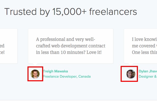
3. Feel the power of the face.
People who excel with technical information, often see the world in a different way than people who excel at human empathy and social interaction.
In general, our brains are highly attuned to the faces (and especially the eyes) of every human being around us. But the more technical our focus, the more we tend to shy away from that human connection that comes from eye contact.
There’s no right or wrong here, we’re all somewhere on the imaginary scale. And we likely go up and down it, depending on the situation and our mood. But when it comes to a marketing website, especially if you’re a technical company, it pays to compensate for what may well be a natural tendency to be less attuned to human faces.
In this case, it’s great to see an attempt to show that human life does exist. Especially with testimonials on most pages. And I love that they’re linked to real Twitter accounts. Well done. But it feels like the intention is being stifled somewhat. The result is “tiny-face-itus”. Where headshots of real humans are used, but they’ve been shrunk down to the size of an atom. 🙂
Action: Action: The cure for this is simple. Expand the heads. Zoom in. Let’s see those real people, with real smiles and real eyes. The audience will have a much easier time connecting your technical solution to their very real human problems, when they can better see that real people are telling the story.

4. Move from abstractions to individuals.
Continuing this theme of focusing on people, let’s look at another part of the homepage. You’ve got a section that lists the type of niche’s you’re trying to target…
Designers, Photographers, Writers, Developers, Videographers, Other contractors.
This is a real opportunity to connect with those people individually. It won’t ever be a category of “other contractors” who signs up to your service and becomes a loyal customer. It will be an individual. And individuals don’t see themselves as categories.
They do feel part of communities. And they do relate to community norms. But they also like to think of themselves as unique individuals.
So, if you want to get the attention of a designer, then show me a designer I can relate to. If you want to get the attention of a photographer, show me a human with a camera. What gets my attention as a human being is “people like me”.
Action: Showing real people, who represent the individuals you want to do business with, helps people feel like you “see them” and you “understand their specific problems”.
5. Connect with those communities.
This idea of a “people first approach” can add life to every part of a website. Overall, this website is already operating at quite a high level, you’re doing a lot of stuff right. But despite having a couple of useful tools which technically do connect you to the outside, it feels very isolated. It feels disconnected from the rest of the world.
Let’s go back to the various niche’s we want to attract – Designers, Writers, Developers etc.
Not only can we show “people like us” from those communities, but we should show thought leaders, press members, industry icons and heroes from those communities. There should be a feeling of flow and connection between our site and the communities we serve. A web of ingoing and outgoing links, stories, interviews and opinions.
For example, right here on this site, as well as connecting with various communities through these tune-ups, we also have interesting conversations with people like Mark Cuban, Seth Godin, Laura Roeder and many others.
Every website should feel like an established part of the community it wants to serve.
Often, the blog is the place where a lot of these connections are created. But they shouldn’t be limited to the blog. Listing all your press mentions (with links) helps create that sense of belonging to the industry you’re a part of. And having industry thought leaders say good things about you, will work just about anywhere.
Let’s look at the blog posts for a moment. And consider the challenges we face there. Right now we have some promising headlines that seem to fit the market you’re targeting.
Should freelancers ever work for free?
Avoiding isolation as a freelancer.
3 ways to manage your time as a freelancer.
These could all be valuable and useful topics for your target customers. But if you’re using content marketing you have to go all in. First of all, doing an average post isn’t ever going to be enough. It won’t be seen, it won’t be shared, it won’t generate SEO or links, it won’t serve its intended purpose.
You have to create the best post ever on the topic you’re covering. You’re better creating 4 epic posts a year than 52 average ones. Then promoting the heck out of those posts in the appropriate communities.
And having a post that is super well defined will always help it spread through a community. “Freelancers” are a category but not really a community. “Freelance developers” is getting closer. “Freelance developers in San Francisco” is even closer to a real community. People who live a shared experience and talk about things they value, with people they trust.
Consider the difference between these two headlines…
1. Should freelancers ever work for free?
or
2. “I’m a freelance developer who’s just arrived in San Francisco, should I work for free to get my foot in the door?”
Here’s another…
1. Avoiding isolation as a freelancer.
or
2. How to avoid insanity if you’re a Mom, and a Writer, who works from home.
And another…
1. 3 ways to manage your time as a freelancer.
or
2. 3 ways to get paid faster, if you’d rather do your Art than chase invoices.
I just quickly made those up off the top of my head. But I hope you can see the pattern. Generic vs specific. Category vs community or individual.
None of us wants generic advice. We want specific, tailored empathy from someone who knows our unique problems and talks directly to them. Now, the beauty of this approach is, you can write one really good post about isolation, or time management or whatever, and then adapt that core idea to multiple, specific niche’s. But each has to be given the care and attention and thought, as if it were written only for them.
In this way, you can start to really connect with these communities. The flow of links will start to grow. You’ll be seen as the perfect solution to their problems. And you’ll also be viewed as a member of their tribe. This is when people start to share your content and talk about you. When your advice genuinely helps the tribe live better lives.
Action: Ditch generic categories in favor of specific communities. Connect with thought leaders and heroes. Show the human beings in those tribes. Create fantastic content that’s tailored to smaller groups.
[userpro_private]
6. Remember that pitching to consumers isn’t the same as pitching to a VC.
When you’re starting out, getting your pitch right can be a complex process. It’s complex because you’re still trying to make sense of your product yourself. And you’re trying to explain your idea to people from all walks of life.
On the “About” page, I came across this mini version of the pitch…
Great freelancers aren’t necessarily the best designers or developers. They’re great business people. We realized those business skills can be embedded in software, and thus Bonsai was born.
That’s pretty much all you say about your company and team. (Which is a missed opportunity in itself). Who are the people behind this, what are their human likes and interests. What is your personal origin story? What is your connection to freelancing?
But aside from that, the one thing you are saying, sounds like a pitch you’d use to explain your service to a VC. Someone who is OUTSIDE of the market and OUTSIDE of experiencing the pain you’re trying to solve.
But just a few lines down from this abstract pitch, I found a link to a job vacancy. In that vacancy you actually explain the problem you’re trying to solve better than anywhere else on the website. You say…
50%+ of freelancers are paid late or not at all, and this causes them to be late on rent, credit card bills, and worse.
That line, hidden away on a job description would be better as a headline on the homepage. It speaks directly to the pain your customers will be feeling and how that pain can get worse when the problem is left unsolved.
Now, all you have to do is make that pain personal. Don’t talk in a detached voice, to an abstract category. Talk in a personal voice to the one person who will be reading your copy.
1. 50%+ of freelancers are paid late or not at all (Impersonal, detached, may or may not relate.)
becomes
2. “As a freelance developer you already know that half the time you end up getting paid late, or not at all…” (Personal, specific, they’ll feel this more.)
Action: Go through each page and ask yourself “Am I speaking directly to my intended customer right now?” And then be as direct and specific as you can in each instance.
[/userpro_private]
Summary
I could go on, but that’s all I have time for this week. These guys are doing a great job. The overall pitch and concept appears sound. They just have to turn up the personal, emotional appeal. Not be afraid to highlight the pain at each point in the pitch.
Then it’s all about bringing in and showing real humans from the communities they want to connect with. Heroes, authorities, press and real representative users. The site should feel alive, flowing in and out of the extended communities. At the center of it all, is not the technology, but the customer.
If you got value from this post we’d love to hear from you. And you can apply for your own website marketing tune-up here. Until next week, stay the course, see it through, make your mark!