
This week I’m looking at Matt’s website hellobonsai.com He’s a Y-Combinator start-up, helping freelancers get paid faster, with less stress along the way. Some people like to call these teardowns. But I’m not a big fan of the term. The people who ask for my feedback are smart and willing to share with the community. I really respect what they’re doing and I’m here to support them. So, I much prefer the term “tune-up”. Let’s dive in and see what we can all learn.

1. Leading with the problem often commands more attention.
So, I land on the home page and I’m greeted with the standard summary of “what we do” comprising a headline and sub-header.
Peace of mind for freelancers
Bulletproof contracts, e-signing, & integrated payments.
Get peace of mind & get on with your work.
It’s not bad, it’s identifying the target market. And it’s telling me that I can find help with contracts, payment tools and “peace of mind”. It all sounds very pleasant.
This initial description of “what you do” and “where your value lies” is critical. And it’s really a boiled down version of your overall sales pitch. So, every word counts. Here’s how I’d start testing alternatives for more effectiveness…
First of all, it often helps to start with the problem, not the solution. There’s a reason people are reading your pitch in the first place. They have a problem and they’re hunting for a solution.
People who don’t have problems. The guys who are already “getting on with their work” and loving life. Those guys aren’t the ones reading your pitch.
It’s the people who are suffering the most, who are going to invest time in learning about your offer. So, speak to their pain. Show them that you understand their problems. Identify the issues that will naturally grab their attention. Only after you have their attention and you’ve shown them your solution, does it make sense to paint a picture of that “better life” they’re going to be living.
Right now, the thing you’re highlighting is really a features list – contracts, e-signing, payments. The interesting thing is, deeper down in this site, you already have all the copy that you need to grab your reader’s attention. It’s really all about leading with the copy that triggers those emotions.
Ponder that word – emotion. Feelings that create motion. Ideas that make us move. Action triggers. Some psychologists have said that there’s ultimately only one emotion – excitement. When faced with a problem we are unable to solve, our brain supports us with “excitement” in the form of specific emotions. Those emotions temporarily shore up our lack of skill and help us solve the problem.
That “excitement” is what sends us looking for solutions. Our brain becomes hyperactive. In that state, what we’re really looking for is someone we can relate to, another human being just like us. Someone holding up a sign saying “I had this problem, I’m just like you, here’s how I solved it.”
If I scroll down the page, just below the fold on my screen, I see a sub-header with far more emotional impact. But because of its position, color and place in the hierarchy, it’s getting far less attention…
Freelancers get paid an average of 13 days faster,
and have 3x fewer late payments with Bonsai.
This is a much more powerful approach. And one I’d try leading with. Notice how the attention is now far more balanced between problem (Late payments) and solution (Get paid 13 days faster). This will get the attention of freelancers, who are in that “excited” state of “trying to solve their payment problems” more than the current headline.
Action: Don’t be afraid to lead with the problem. Don’t be afraid to be negative. Customers who act are usually in an emotional state. They have a problem and they’re looking for someone who clearly understands it, before they will believe you have a viable solution.

2. The smaller the site, the easier it is to create a sense of flow and maintain attention.
I think when we’re designing home pages, there’s an unspoken pressure to give an overview of everything we do. In the corporate world, it often results in political battles and ineffective designs. But for a start-up, we really don’t need to treat the home page like it’s disconnected from the rest of the site. In this particular case, when a company has a single well-defined product, you don’t need a “home page pitch” and then “another pitch” somewhere else. It actually confuses your reader and makes it harder to understand what you’re all about.
I mentioned in last week’s openlistings.com tune-up, that some of the pitch pages were redundant and could be consolidated. And the same applies here.
A marketing website is essentially just a sales pitch. And a sales pitch is just a persuasive conversation. Many sites would be improved if they started life as a single page. One page. With a clear, flowing and deepening pitch. And when you’ve nailed your pitch, when you really understand what motivates your customers to act (which can take anything from months to years) only then do you split it up over several pages. If you really must.
In this case, on the home page, we have a 4 point illustrated rundown of the tools that Bonsai offers. 3 of those points link to a secondary page, which is almost identical to the homepage. But it actually has more compelling copy and highlights the price in a much clearer way.
One of those pages is unnecessary, and should be consolidated. I’d be laying out the whole pitch on the home page. Or, even better, start with a video run-through of the concept (see Basecamp’s simple video walk-through) and then continue with a more detailed and illustrated, written version of the pitch.
Action: It’s hard enough for people to understand the basics, don’t make them work for it. Consolidate where ever possible.
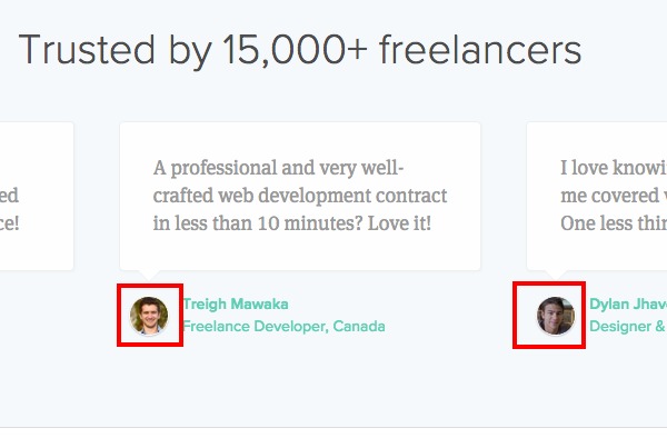
3. Feel the power of the face.
People who excel with technical information, often see the world in a different way than people who excel at human empathy and social interaction.
In general, our brains are highly attuned to the faces (and especially the eyes) of every human being around us. But the more technical our focus, the more we tend to shy away from that human connection that comes from eye contact.
There’s no right or wrong here, we’re all somewhere on the imaginary scale. And we likely go up and down it, depending on the situation and our mood. But when it comes to a marketing website, especially if you’re a technical company, it pays to compensate for what may well be a natural tendency to be less attuned to human faces.
In this case, it’s great to see an attempt to show that human life does exist. Especially with testimonials on most pages. And I love that they’re linked to real Twitter accounts. Well done. But it feels like the intention is being stifled somewhat. The result is “tiny-face-itus”. Where headshots of real humans are used, but they’ve been shrunk down to the size of an atom. 🙂
Action: Action: The cure for this is simple. Expand the heads. Zoom in. Let’s see those real people, with real smiles and real eyes. The audience will have a much easier time connecting your technical solution to their very real human problems, when they can better see that real people are telling the story.

4. Move from abstractions to individuals.
Continuing this theme of focusing on people, let’s look at another part of the homepage. You’ve got a section that lists the type of niche’s you’re trying to target…
Designers, Photographers, Writers, Developers, Videographers, Other contractors.
This is a real opportunity to connect with those people individually. It won’t ever be a category of “other contractors” who signs up to your service and becomes a loyal customer. It will be an individual. And individuals don’t see themselves as categories.
They do feel part of communities. And they do relate to community norms. But they also like to think of themselves as unique individuals.
So, if you want to get the attention of a designer, then show me a designer I can relate to. If you want to get the attention of a photographer, show me a human with a camera. What gets my attention as a human being is “people like me”.
Action: Showing real people, who represent the individuals you want to do business with, helps people feel like you “see them” and you “understand their specific problems”.
5. Connect with those communities.
This idea of a “people first approach” can add life to every part of a website. Overall, this website is already operating at quite a high level, you’re doing a lot of stuff right. But despite having a couple of useful tools which technically do connect you to the outside, it feels very isolated. It feels disconnected from the rest of the world.
Let’s go back to the various niche’s we want to attract – Designers, Writers, Developers etc.
Not only can we show “people like us” from those communities, but we should show thought leaders, press members, industry icons and heroes from those communities. There should be a feeling of flow and connection between our site and the communities we serve. A web of ingoing and outgoing links, stories, interviews and opinions.
For example, right here on this site, as well as connecting with various communities through these tune-ups, we also have interesting conversations with people like Mark Cuban, Seth Godin, Laura Roeder and many others.
Every website should feel like an established part of the community it wants to serve.
Often, the blog is the place where a lot of these connections are created. But they shouldn’t be limited to the blog. Listing all your press mentions (with links) helps create that sense of belonging to the industry you’re a part of. And having industry thought leaders say good things about you, will work just about anywhere.
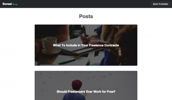
Let’s look at the blog posts for a moment. And consider the challenges we face there. Right now we have some promising headlines that seem to fit the market you’re targeting.
Should freelancers ever work for free?
Avoiding isolation as a freelancer.
3 ways to manage your time as a freelancer.
These could all be valuable and useful topics for your target customers. But if you’re using content marketing you have to go all in. First of all, doing an average post isn’t ever going to be enough. It won’t be seen, it won’t be shared, it won’t generate SEO or links, it won’t serve its intended purpose.
You have to create the best post ever on the topic you’re covering. You’re better creating 4 epic posts a year than 52 average ones. Then promoting the heck out of those posts in the appropriate communities.
And having a post that is super well defined will always help it spread through a community. “Freelancers” are a category but not really a community. “Freelance developers” is getting closer. “Freelance developers in San Francisco” is even closer to a real community. People who live a shared experience and talk about things they value, with people they trust.
Consider the difference between these two headlines…
1. Should freelancers ever work for free?
or
2. “I’m a freelance developer who’s just arrived in San Francisco, should I work for free to get my foot in the door?”
Here’s another…
1. Avoiding isolation as a freelancer.
or
2. How to avoid insanity if you’re a Mom, and a Writer, who works from home.
And another…
1. 3 ways to manage your time as a freelancer.
or
2. 3 ways to get paid faster, if you’d rather do your Art than chase invoices.
I just quickly made those up off the top of my head. But I hope you can see the pattern. Generic vs specific. Category vs community or individual.
None of us wants generic advice. We want specific, tailored empathy from someone who knows our unique problems and talks directly to them. Now, the beauty of this approach is, you can write one really good post about isolation, or time management or whatever, and then adapt that core idea to multiple, specific niche’s. But each has to be given the care and attention and thought, as if it were written only for them.
In this way, you can start to really connect with these communities. The flow of links will start to grow. You’ll be seen as the perfect solution to their problems. And you’ll also be viewed as a member of their tribe. This is when people start to share your content and talk about you. When your advice genuinely helps the tribe live better lives.
Action: Ditch generic categories in favor of specific communities. Connect with thought leaders and heroes. Show the human beings in those tribes. Create fantastic content that’s tailored to smaller groups.
[userpro_private]
6. Remember that pitching to consumers isn’t the same as pitching to a VC.
When you’re starting out, getting your pitch right can be a complex process. It’s complex because you’re still trying to make sense of your product yourself. And you’re trying to explain your idea to people from all walks of life.
On the “About” page, I came across this mini version of the pitch…
Great freelancers aren’t necessarily the best designers or developers. They’re great business people. We realized those business skills can be embedded in software, and thus Bonsai was born.
That’s pretty much all you say about your company and team. (Which is a missed opportunity in itself). Who are the people behind this, what are their human likes and interests. What is your personal origin story? What is your connection to freelancing?
But aside from that, the one thing you are saying, sounds like a pitch you’d use to explain your service to a VC. Someone who is OUTSIDE of the market and OUTSIDE of experiencing the pain you’re trying to solve.
But just a few lines down from this abstract pitch, I found a link to a job vacancy. In that vacancy you actually explain the problem you’re trying to solve better than anywhere else on the website. You say…
50%+ of freelancers are paid late or not at all, and this causes them to be late on rent, credit card bills, and worse.
That line, hidden away on a job description would be better as a headline on the homepage. It speaks directly to the pain your customers will be feeling and how that pain can get worse when the problem is left unsolved.
Now, all you have to do is make that pain personal. Don’t talk in a detached voice, to an abstract category. Talk in a personal voice to the one person who will be reading your copy.
1. 50%+ of freelancers are paid late or not at all (Impersonal, detached, may or may not relate.)
becomes
2. “As a freelance developer you already know that half the time you end up getting paid late, or not at all…” (Personal, specific, they’ll feel this more.)
Action: Go through each page and ask yourself “Am I speaking directly to my intended customer right now?” And then be as direct and specific as you can in each instance.
[/userpro_private]
Summary
I could go on, but that’s all I have time for this week. These guys are doing a great job. The overall pitch and concept appears sound. They just have to turn up the personal, emotional appeal. Not be afraid to highlight the pain at each point in the pitch.
Then it’s all about bringing in and showing real humans from the communities they want to connect with. Heroes, authorities, press and real representative users. The site should feel alive, flowing in and out of the extended communities. At the center of it all, is not the technology, but the customer.
If you got value from this post we’d love to hear from you. And you can apply for your own website marketing tune-up here. Until next week, stay the course, see it through, make your mark!


